Ever clicked on a website buzzing with excitement, only to find yourself staring at a never-ending loading screen? Your fingers hover over the mouse, debating whether to click away or not.
Now, let’s flip the script. Imagine that it’s your website, and those restless users are potential loyal customers slipping through your fingertips. Feeling a mix of urgency and a bit of disappointment? We get it, and we’re here to help you avoid this scenario.
You’re about to dive headfirst into transforming your sluggish, poorly-designed website into an attractive, high-converting powerhouse.
No more crossed fingers hoping your visitors will stick around despite the slow load times. No more agonizing over why users bounce faster than they got there. We’re talking action plans, game-changing strategies, and straight-up website wizardry. Let’s begin!
With Small Business Digital Ready, you gain access to free events hosted by industry experts. Plus, get opportunities to network with peers in your area.
1. Bounce Rate
Think of your website’s bounce rate as a first impression. When someone walks into a room and immediately walks out, it’s pretty clear they didn’t find what they were looking for or didn’t like what they saw.
A high bounce rate on your website signals the same sentiment – it means visitors are landing on your site but leaving without interacting further. It’s your website’s way of telling you, “Hey, something’s not working here.”
So, how do you make that first impression a lasting (and positive) one? Let’s discuss two game-changing strategies:
Ensure Your Site Is Mobile-Friendly
Your website isn’t just viewed on spacious desktop screens. As a matter of fact, about 60% of people access websites from their smartphones. That’s a solid indication that the days of mobile being an afterthought are long gone.
Even Google’s ranking algorithms are all in on mobile-first indexing. In plain English, that translates to “your mobile site better be good.”
So, the lesson here is a simple one: Design your website with mobile in mind. Ensure that everything looks good and loads properly on various smartphone models.
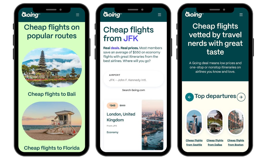
A great example of knocking it out of the park in this regard is Going, a premium platform for snagging cheap flights. They’ve nailed an ultimate mobile experience. Their website, particularly their airfare alerts landing page, is a textbook example of what mobile optimization looks like.
They haven’t only managed to fit all of their content into a smaller screen. They designed a smooth, interactive experience that impresses every time you browse their site. The colors pop, the fonts are appealing to the eye, and the images scale perfectly.
Going understands that a significant chunk of their audience books flights on the go, and their mobile-friendly design ensures they don’t miss out on those potential conversions.
Source: going.com
Prioritize Customer Value over Product Features
The secret sauce to a successful website isn’t just showcasing what your product does. It’s articulating how it will make your visitors’ lives better. Why? Because emotions drive decisions.
If your site can make a visitor feel like they’re already achieving their goals, it’s safe to say that you’ve begun building a community of supporters and reducing the bounce rate.
Take a look at Aura, an Amazon repricer & revenue analytics software designed to outshine the competition. From the moment you land on their site, you’re not overpowered with technical jargon or endless features.
Instead, their header gets straight to the point with compelling benefits: “Maximize Amazon Sales,” “Maximize your time in the Amazon Buy Box,” and “Increase both sales and profits for FBA sellers.”
By focusing on the outcomes, not just the features, Aura captures attention and drives home the value they’re offering.

Source: goaura.com
So, when you start seeing your bounce rate as more than just a percentage but as an indicator of first impressions and customer engagement, you’ll know exactly how to turn those single-page visits into lasting relationships.
2. Sales Conversion Rate
Sales conversion rates tell you a lot more than how many people clicked a button. They illuminate how effectively your site turns a casual browser into a committed buyer.
With ecommerce sales expected to hit $7.4 trillion in 2025, according to eMarketer, getting your conversion game on point is non-negotiable.
So, how do you lift those numbers? Let’s explore this in more detail.
Make Product Demos Easy
Think of your website as a virtual storefront. When customers can’t physically touch or try out your product, demonstrations fill that gap and help them get a sense of what you’re offering.
Making these demos simple and accessible can go a long way in nudging that undecided visitor toward a purchase.
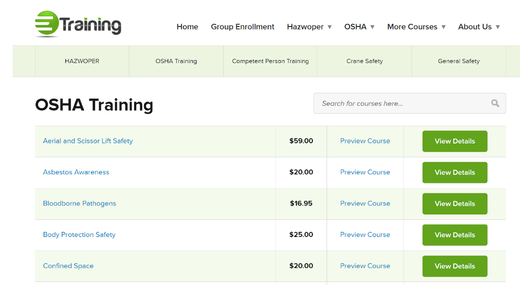
Let’s see how eTraining, a forerunner in online workplace safety training, did this with great success. They’ve got this tactic down to an art form.
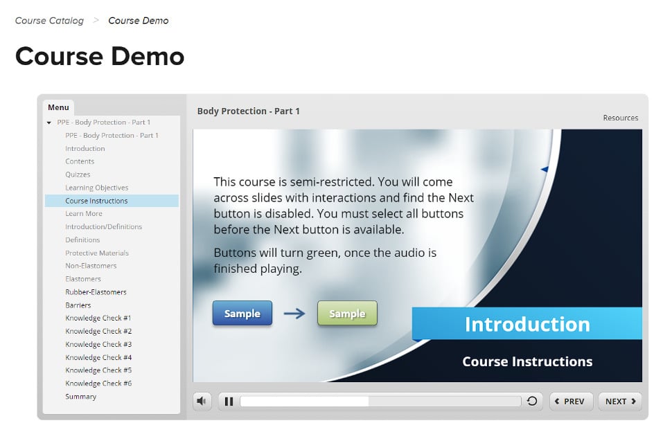
Instead of dumping a ton of textual information on the courses they offer, eTraining lets visitors preview each course through concise, well-crafted videos. These demos expertly demonstrate how each course looks and works.
It’s a super clever show-and-tell approach that helps eTraining turn curious visitors into enrolled students.
Source: etraintoday.com
Source: etraintoday.com
Address Common Conversion Obstacles
Let’s face it: we’ve all abandoned a cart due to some last-minute uncertainties – be it shipping costs, delivery times, or return policies. Tackling these common conversion hurdles head-on can make the difference between an abandoned cart and a completed sale.
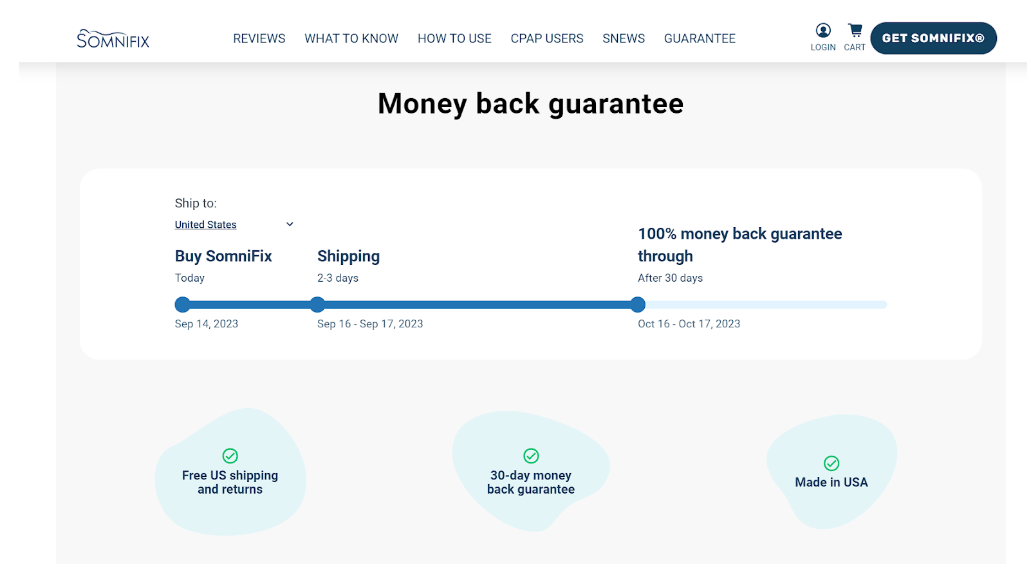
SomniFix, a company that sells mouth strips designed for better sleep, is an expert at this. They’re not big fans of tucking away essential information in some hard-to-find FAQ section.
Instead, on their SomniFix Mouth Strips product page, they lay out all the details about shipping, refunds, returns, and their money-back guarantee.
What’s more, they’ve crafted an easy-to-follow illustration showing when the product will arrive and for how long the money-back guarantee lasts. It’s all about providing peace of mind to potential customers, and SomniFix does this exceptionally well.
Source: somnifix.com
Transforming a visitor into a customer isn’t about tricks or gimmicks but about providing a seamless, intuitive experience that meets needs and dispels doubts. That’s how you take your sales conversion rate to the next level.
3. Average Order Value
When it comes to ecommerce, Average Order Value (AOV) might not get the spotlight as much as conversion rates or traffic stats, but make no mistake – it’s definitely a big deal.
Your AOV tells you how much money customers are spending on your site when they make a purchase. And guess what? Boosting this number can significantly impact your bottom line without having to attract a single new customer.
It’s all about making the most of the traffic you already have. Let’s discuss a way to raise that AOV ceiling.
Simplify Your Cross-Selling UX
We’ve all been there – you go online to buy one thing and end up with three. That’s cross-selling in action. But there’s a fine line between enticing customers to buy more and overwhelming them with options.
The purpose of a well-designed User Experience (UX) for cross-selling is to boost sales, of course. But it’s also there to amplify customer satisfaction by making the process painless and even enjoyable.
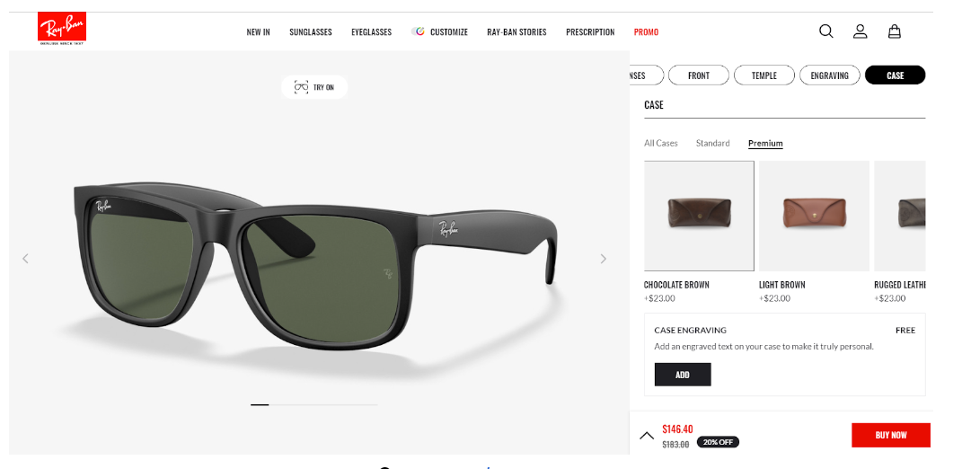
Now, let’s talk Ray-Ban, the eyewear behemoth that’s got this down to a science. Have you ever explored their “Customize” feature? It’s a masterpiece of UX design.
Ray-Ban allows you to build your dream pair of sunglasses, starting from the lenses and frame colors right down to engraving options and the type of case. The kicker? They make it incredibly simple to add these extra touches.
The interface is squeaky clean, with no clutter and zero confusion. The steps to customize are linear and intuitive, leaving no room for guesswork. The result is a product tailored to your exact specifications, making it extremely hard to resist buying that exact product version.
By simplifying their cross-selling UX, Ray-Ban does encourage you to spend more, but they make the process so seamless that it feels less like a transaction and more like a personal project.
Source: ray-ban.com
That’s how upping your Average Order Value works. Rather than forcing more into your customers’ carts, you want to optimize their experience so that they willingly add more.
4. Average Session Duration
Average Session Duration might seem like just another number on your analytics dashboard, but don’t underestimate it – it’s your covert agent reporting back on user engagement.
This metric tells you how long visitors are hanging out on your website, and longer durations typically mean your content is resonating.
But, just keeping them around isn’t enough. You need to make the time they spend count. Here, we’ll help you come up with strategies that can ensure your users stick around and find value. Let’s dive in.
Embrace Video
In the age of TikTok and Insta Reels, where visual content reigns supreme, incorporating videos means a lot more than adding some flashy extras – it’s almost a requirement. Videos simplify complex ideas, provide in-depth insights, and offer a refreshing break from endless text. All these benefits contribute to increasing the amount of time users spend on your website.
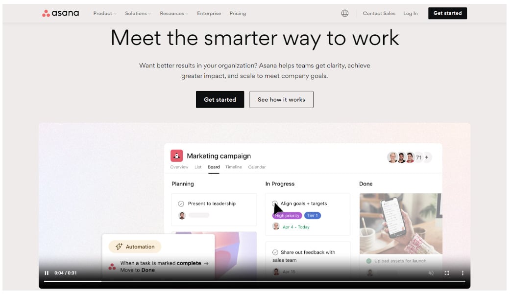
Asana, the team and project management platform, is a fantastic example of this strategy. The moment you land on their homepage, you’re greeted by a short, animated video that effortlessly explains their wide array of services.
What’s brilliant here is that the video is engaging but brief, offering a quick yet comprehensive overview without requiring a significant time commitment. The immediate effect is that users are more likely to stay on the site to explore further, driving up the average session duration.
Asana’s strategy showcases how a well-placed, well-crafted video can serve as a compelling introduction and a sticky feature that keeps users engaged.
Source: asana.com
Make Written Content Highly Accessible
We’ve all visited pages filled with giant blocks of text and immediately hit the “back” button. A wall of text can be as unwelcoming as a closed door. Breaking up your content with images, tables, bullets, and excellent typography can make even long reads inviting.
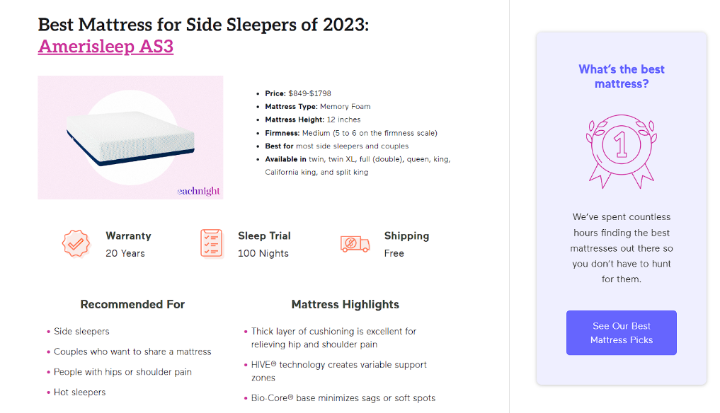
Let’s look at Eachnight, a leading platform in mattress guides and bedding resources. Take their “Best Mattress for Side Sleepers” post as an example. The page is a lot more than a scroll of endless paragraphs. It’s a well-designed guide where images break up the text, tables summarize key points, bullet lists provide easy takeaways, and trust badges reinforce credibility.
The typography is a reader’s dream, making the content not only digestible but quite enjoyable, too. With such accessible written content, it’s no surprise visitors spend more time reading, exploring, and ultimately, trusting eachnight as an authority.
Source: eachnight.com
So, if you thought the Average Session Duration was just a by-the-way metric, think again. This underrated stat holds a mirror up to your content and user experience, helping you pinpoint exactly what’s hooking your audience.
5. Page Load Speed
If there’s one metric that can give you instant insights into user satisfaction, it’s Page Load Speed. Google’s research shows that as page load time goes from one second to three seconds, the probability of a bounce increases by 32%. So, in a time where every second counts, ensuring your web pages load swiftly is mandatory.
With 5G networks already rolling out everywhere and consumers’ expectations skyrocketing, slow load times can leave you in the digital dust.
Below, we’ve got some tools and strategies that can get you up to speed. Let’s accelerate into the details.
Test, Measure, and Improve
Before getting into fixes, it’s essential to know where you stand. Tools like Google’s PageSpeed Insights, WebPageTest, and GTmetrix provide detailed reports on what’s slowing down your site and suggest actionable steps for improvement.
Optimize Your Images
One of the most common culprits for slow load times is oversized, high-resolution images. Compress your images without sacrificing quality using tools like TinyPNG or ImageOptim. Smush is also a super powerful plugin if you’re using WordPress for your website.
Minify CSS, JavaScript, and HTML
Your code can be bulky, and every unnecessary line, whitespace, or comment adds to your page load time. Minification removes these extra elements. Tools like UglifyJS and CSSNano can automate this process for you.
Leverage Browser Caching
By setting expiry dates for certain types of files, you can leverage the visitor’s browser to store these files locally. This makes subsequent page loads much faster. You can do this manually by tweaking your .htaccess file or by using plugins like W3 Total Cache if you’re on the WordPress platform.
Consider Content Delivery Networks (CDNs)
CDNs like Cloudflare and Fastly cache your website on global servers, effectively reducing the distance between the server and the user. This results in faster page loads.
Implement Lazy Loading
Lazy loading postpones the loading of off-screen images and media until the user scrolls down to them. This tactic can significantly speed up the initial page load time. Various JavaScript libraries, like Lozad.js, make implementing lazy loading straightforward.
AMP It Up
Accelerated Mobile Pages (AMP) is a Google-backed project designed to make mobile pages ultra-fast. If a large portion of your traffic is mobile (there’s no doubt it is), you might want to explore this avenue.
So, there’s no skirting around it – Page Load Speed is a key player in the user experience game. And with so many tools and best practices at your disposal, turning this challenge into an opportunity has never been easier.
The SuN Takeaway
Whew, that was a whirlwind tour of the performance metrics landscape, wasn’t it? Think of these metrics like vital signs for your website – indicators that can tell you if your online presence is robust or needs a little spruce up.
Don’t worry, you’re not alone in this. The internet is brimming with tools, technologies, and strategies designed to help you level up. And you don’t have to tackle all these metrics at once. Take a phased approach. Test, learn, and pivot. Your website is a living, breathing entity that can (and should!) constantly evolve.
It’s all about creating an ecosystem where your visitors not only land but also linger, learn, and, most importantly, convert.
In an era where every click, scroll, and tap holds potential, the opportunities for improvement are endless. So, get to work and dig into these strategies. Your next performance breakthrough could be just a metric away.


