There are plenty of small e-commerce brands doing big things when it comes to selling online. These brands are a great source of inspiration for anyone looking to create a new website or improve their existing one, boasting designs that range from clean and minimalistic to bold and vibrant. You can also get inspired and use a professional e-commerce website builder to make yours look complete and neat.
If you’re not sure where to look when starting an e-commerce business and creating your website design, take a look at some of the following small e-commerce brands for inspiration.
1. Taza Chocolate
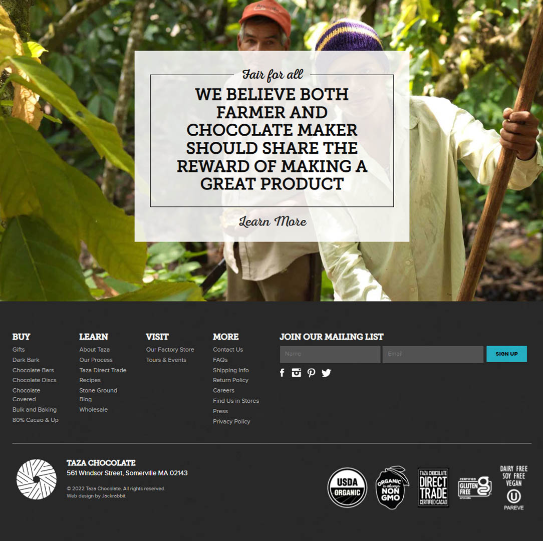
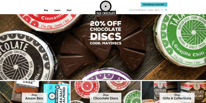
Visitors to Taza Chocolate’s website are met with an immediate discount offer along with various types of Taza chocolate specialties. The design is simple but effective, focusing on the product images and descriptions.
With chocolate being something that many people enjoy, there’s also a gifts and collections section, which is excellent for those looking to buy presents for friends and family.
There’s also a significant focus on the “fair for all” concept, where both the former and the chocolate maker should be applauded and rewarded for their efforts. For those conscious of where a product comes from and how it’s made, this is a great way to win customers over.
Scrolling down further down the page and looking at the website’s footer, there are several logos (including gluten free, non-GMO, USDA organic and others) that help boost the trust that potential customers have in the brand.
Ignoring Website Accessibility: Could It be Killing Your Conversions?
2. Sugar Cosmetics
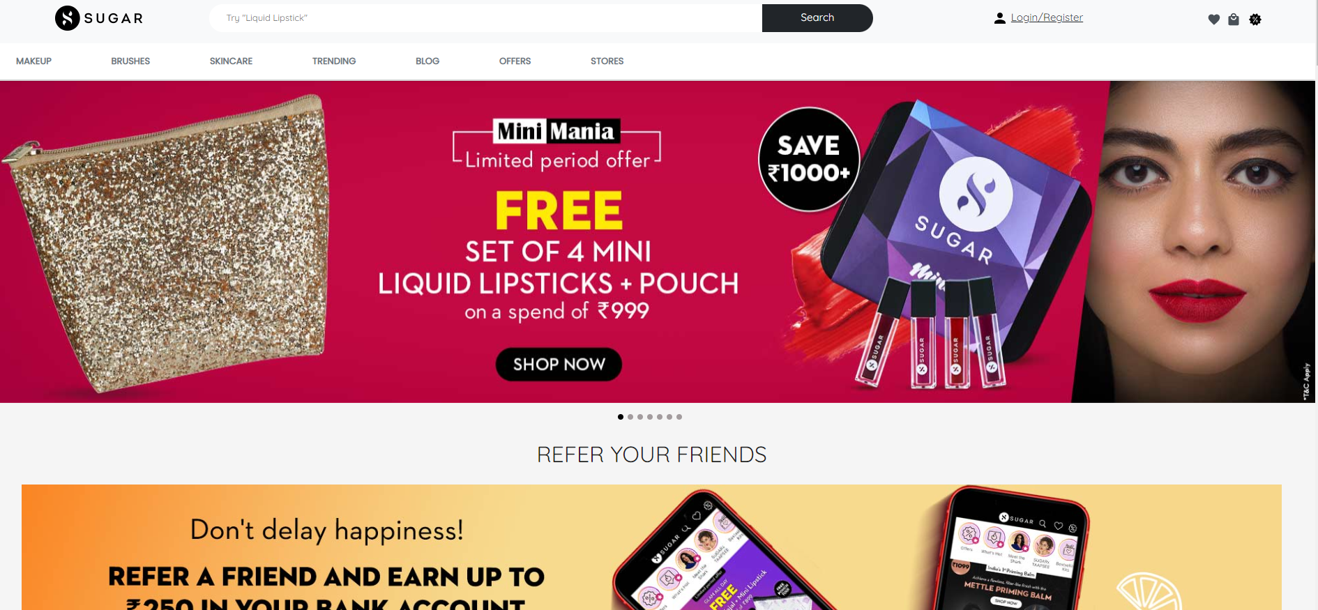
With a rotating banner of images at the top of the website, Sugar Cosmetics does a great job of showcasing its products as visually appealing.
The website has a very feminine feel to it, which is achieved through various pastel colors and fonts.
The navigation is also well-designed, with a top menu that caters to makeup, brushes, skincare, etc. This makes it easy for visitors to find what they’re looking for, whether it’s a specific product or they’re just browsing the range.
There’s also a big focus on referral marketing, with visitors being promised a commission paid directly to their bank account when they refer a friend. This is a great way to encourage customers to spread the word about the brand.
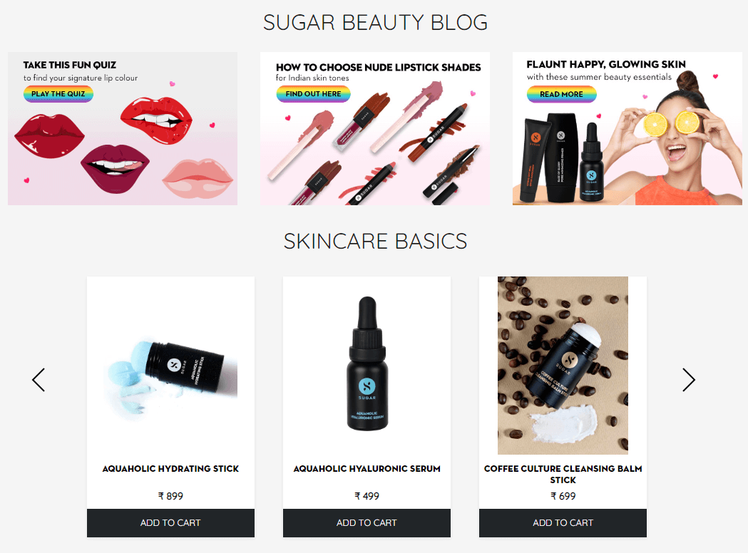
The website also serves to educate its visitors with a “this or that” section that helps people find the right makeup products for their skin type. There’s also a blog containing quizzes, information about skincare basics, and more.
3. Velasca
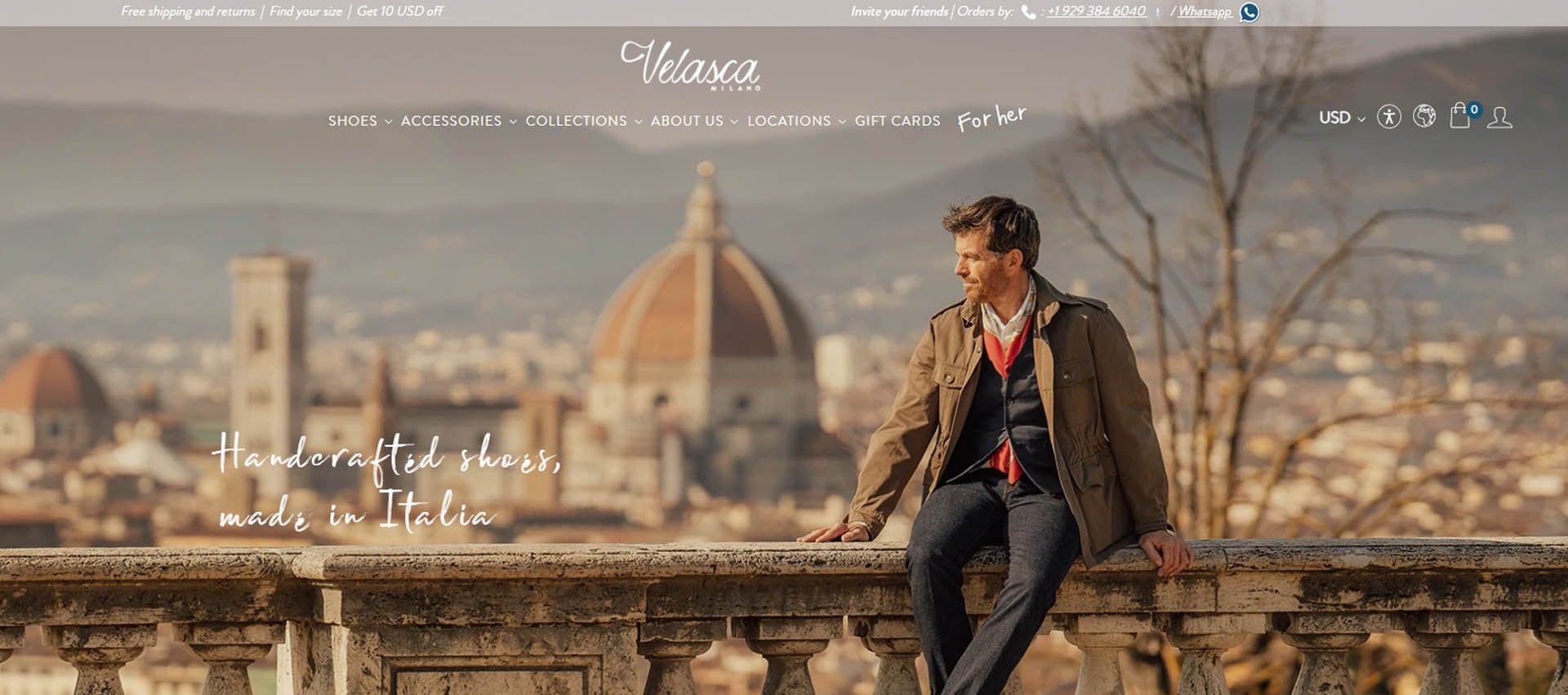
With a slogan of “handcrafted shoes, made in Italy,” Velasca is an e-commerce brand specializing in high-quality footwear.
The website design is immaculate and minimalistic, focusing on the product images. The use of white space coupled with a darker brown color scheme helps to create a stylish and sophisticated look.
The navigation is also well-thought-out, with each type of shoe (lace-ups, cordovan, monk-straps, etc.) having a dedicated page. This makes it easy for visitors to find the right pair of shoes for their needs.
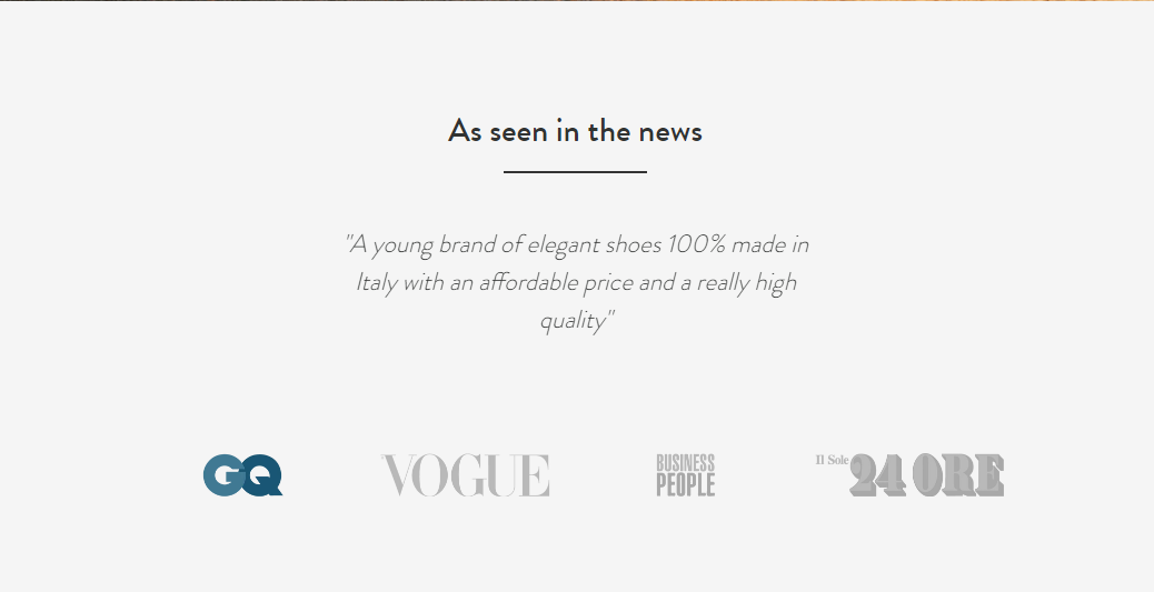
There’s also a small yet significant section that showcases logos from top sites in the industry, including GQ, Vogue, Business People and 24 Ore, all of which help add an extra layer of trust and credibility to the brand.
7 Mistakes New E-Commerce Startups Make and How to Avoid Them
4. Ketnipz
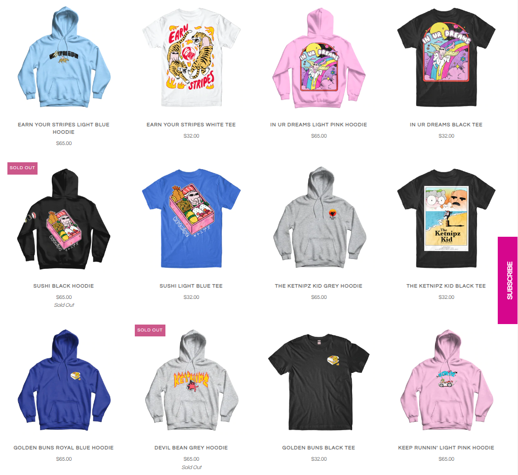
The vivid colors found on Ketnipz will catch your eye, and that’s exactly what they’re supposed to do.
Ketnipz is a small e-commerce brand specializing in apparel, accessories, footwear and even mystery items.
The use of colors and images helps create a fun and playful look, which is perfect for the brand’s target audience. The navigation is also very straightforward, with each type of product having its dedicated page.
There’s also a wide range of items immediately available on the homepage, which is excellent for those just browsing the site.
I also like that when hovering on each product item, the image changes to display a different product angle, which helps to add a touch of interactivity to the website.
5. Training Mask
Training Mask is a brand that specializes in breathing masks and other fitness accessories for hardcore fitness enthusiasts.
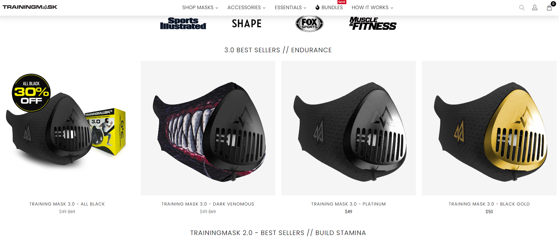
The website design is immaculate and modern, focusing on the product and its features.
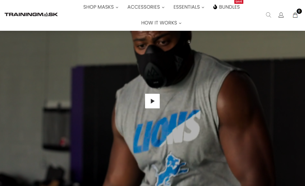
With a video that’s shown above the fold when you first land on the site, it’s clear that Training Mask wants to show off its products in the best possible light and wants to reach a specific target audience of athletes and fitness fanatics.
You can also shop various looks, allowing you to go to specific pages that show you how to style the Training Mask with different types of clothing. This is a great way to boost product sales and encourage people to return to the site.
Moreover, visitors also get to know that they can buy now and pay later, which helps to instill a sense of trust and credibility in the brand while also driving conversions.
6. Hyphensleep
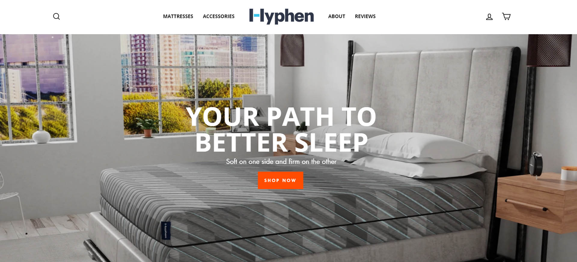
With a straightforward design and a focus on hassle-free shopping, Hyphensleep is an e-commerce brand that specializes in mattresses and bedding products.
The website design makes it clear that the site focuses on providing mattresses, accessories and bedding items that lead to better sleep.
This one main benefit of their product is communicated through both the design and messaging on the website.
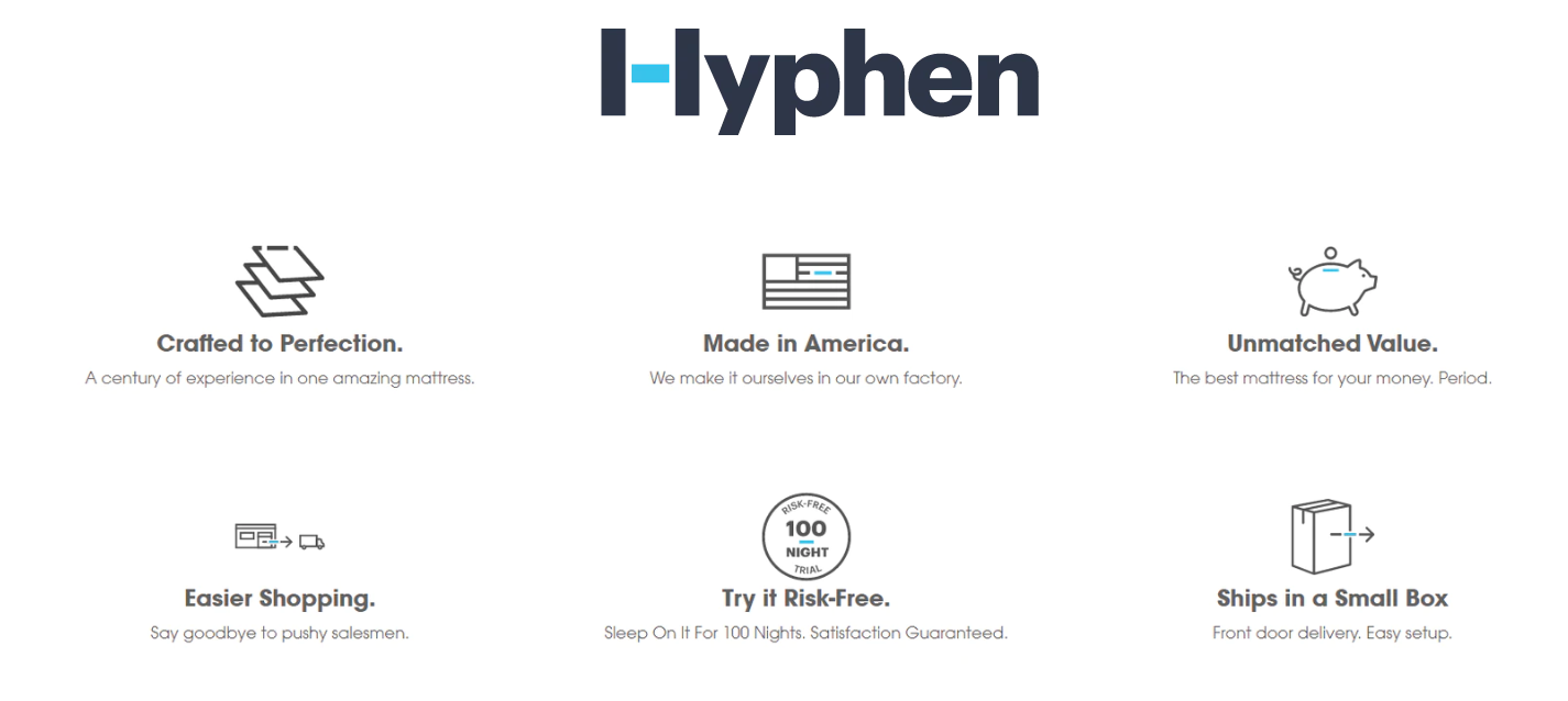
The main features are also mentioned upon a few scrolls of the homepage, and these include crafted to perfection, made in America, unmatched value and more. These all serve to inspire confidence in potential customers.
The simplicity of the website is also a selling point- it allows customers to easily navigate and find what they are looking for – without any distractions.
Conclusion
Creating a positive customer experience is one of the things e-commerce startups should focus on for success.
The right e-commerce website design helps shape customers’ opinions about the brand, so taking a leaf from small businesses and looking into the design elements that work well for them can give you an excellent foundation to start with.
By reviewing the examples above, you can create a design that is both eye-catching and functional.
This will lead to a more enjoyable experience for users and ultimately result in more sales for your business.


