To gain more leads, you’ll need your website visitors to take a specific action. The problem is that many of them don’t want to sign up, fill in your contact form or pay now.
This lack of action can lower your conversion rates and cause much frustration for your team. So how can you convince more prospects to convert? And where on your website should you be convincing them?
The answer is: at your website’s closing section, which is known as the close.
Your website’s close is the last section of every web page. Think of it like as the grand finale. The clincher for your sales deal.
You’ve heard the iconic phrase “always be closing.” And like a good sales conversation, your website also requires a powerful closing technique.
But many startups overlook their website’s close. It’s often considered to be unimportant.
This is a mistake. Remember that exiting from a website is incredibly easy to do. Your web visitors could scroll to the bottom of your web page – and then leave.
Ignoring Website Accessibility: Could It be Killing Your Conversions?
People are fidgety and our attention spans can be chaotic. So control your prospect’s focus. Use your website’s close to capture their attention and convince them to sign up.
The question then remains: How should you write the closing sections on your web pages so that they’re optimized for conversions?
The conversion rate optimization (CRO) expert Joanna Wiebe recommends a variety of powerful closes you can use. Let’s look at each in detail:
Use a value megalist close
How to use this close: Summarize your features’ value to prospects. What do they get when they say yes to you?
Compare the following megalist closes from Airtable and Follow Up Boss.
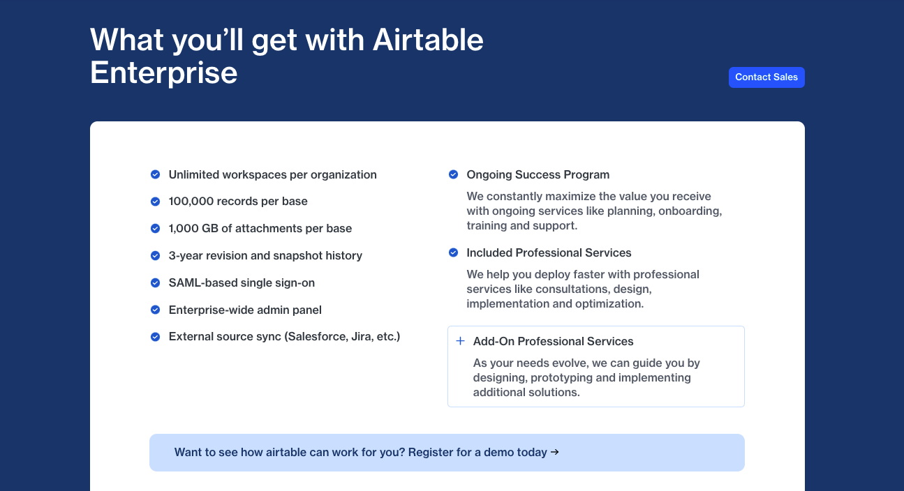
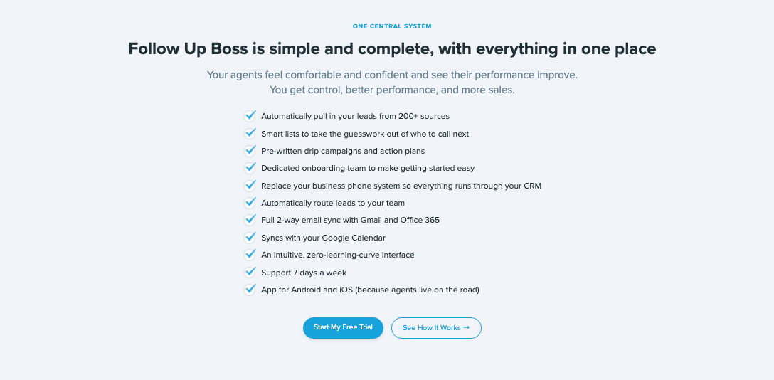
A lot of information is given, right? The aim is to remind you of the high amount of value you’ll receive. This can make you feel confident about clicking the call to action (CTA) buttons – you might feel that you’re getting real value for your investment.
And notice how Follow Up Boss’s close unpacks the value of every feature. For example, the following description looks pretty straightforward: “App for Android and iOS (because agents live on the road).” But there’s a subtle persuasion game being played.
A prospect could feel apathetic toward this app feature: “Who cares if a platform I’ve never used is available as an app?”
But the copy points out that estate agents need an app for an on-the-go lifestyle. It’s a necessity. A problem solver.
Similarly, Follow Up Boss’ description of a “dedicated onboarding team” isn’t just a throwaway feature – it’s described as helping “make getting started easy.”
In comparison, Airtable’s megalist looks more objective and less persuasive. They chose a CTA with the messaging “Contact Sales.” But how many business employees enjoy speaking to salespeople? Instead, Airtable could optimize this CTA by replacing it with “Talk to expert.”
Yes, that actually works – when Greenhouse Software tested the CTA “Request a demo” against “Talk to an expert,” they saw a 240% increase in clicks.
Use an anti-procrastinator close
Many web visitors will feel in two minds about your solution. They’re slightly curious about you. But they’re not fully convinced that they should take action.
It’s the job of your website’s messaging to help them feel more motivated to sign up for you.
How to use this close: Focus your prospects on their biggest motivations.
Notice how Airtable’s close puts their prospect in the starring role:

Many brands (understandably) believe that their website messaging should just be about them – the brand. But a prospect cares less about a brand and more about what they can do using that solution. For this Airtable marketing prospect, their use case involves managing all content projects in one app. So match the conversation happening in your prospects’ heads. Keep your messaging relevant to what they care most about most.
The HEY platform is an email disruptor, requiring the prospect to learn a new workflow. This can create anxiety – “will it be worth all the effort?”
So HEY needs longer messaging to help educate the prospect on why their SaaS is worth trying.
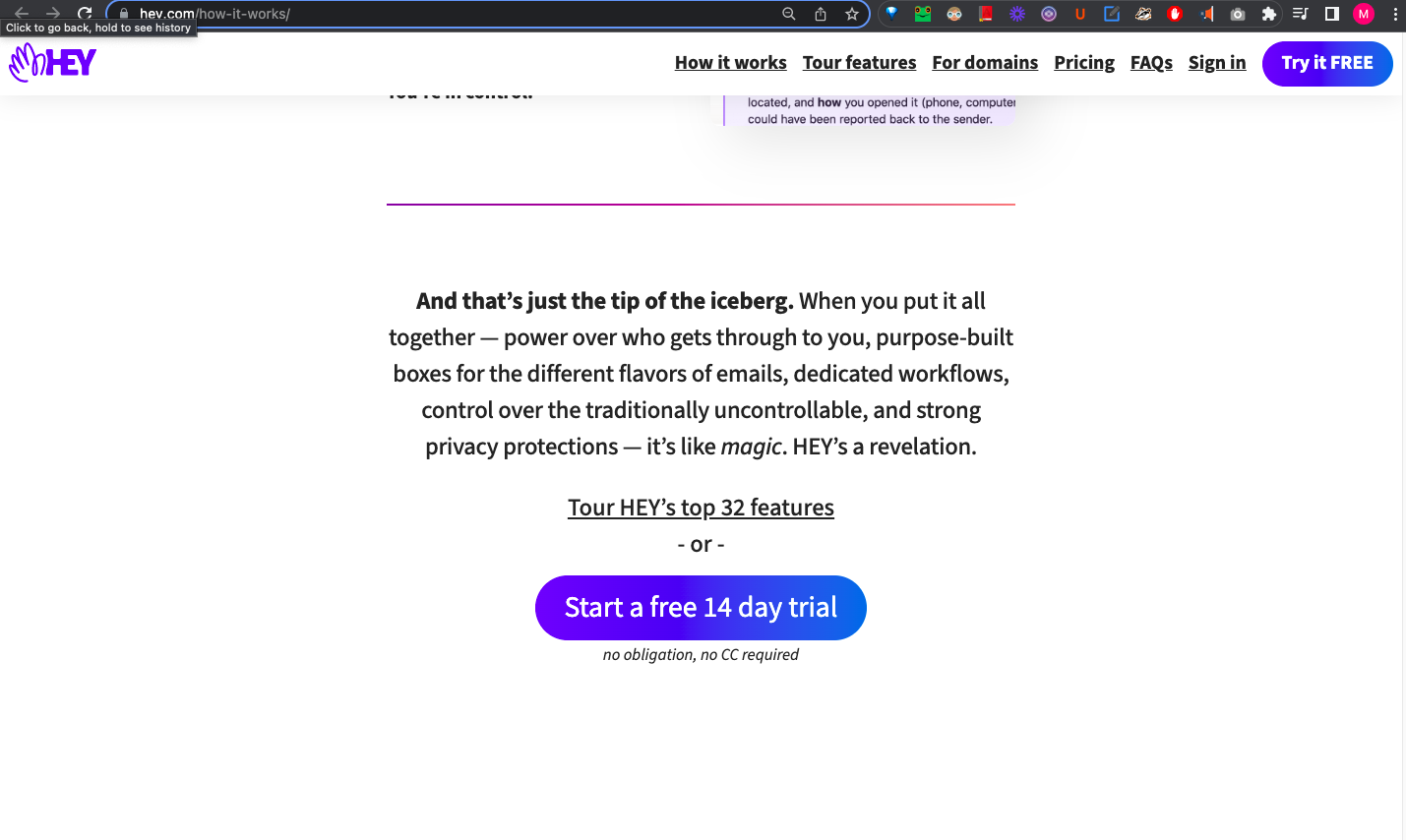
The copy gives a great summary of how HEY can benefit them. Notice how they also give two CTA options for their web visitors. If prospects aren’t yet ready for the free trial, they can instead choose the product tour. That way, HEY can convert even the most hesitant prospects with a low-commitment offer.
Now take a look at Saleshandy’s close. They make a very strong promise designed to catch your attention:
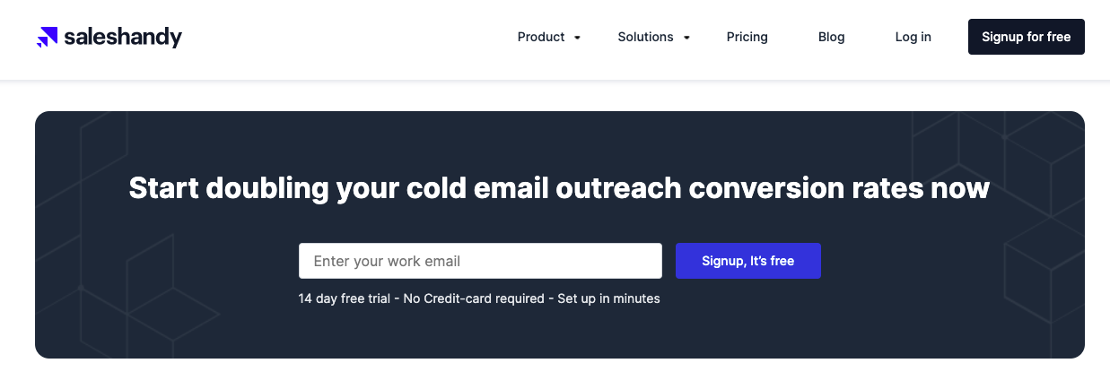
This copy is an instant confidence boost. It addresses the pain points their prospect feels deeply: the struggle to convert people with outbound emails.
Again, Saleshandy make it about the prospect, as opposed to saying “we’re #1 in our category.” The ideal state that their prospects desire – more successful cold outreach – is brought to their attention, just as they’re being asked to make a decision. This is a very strategic move that can help increase conversions.
So which powerful outcomes do your prospects desire? Consider using these outcomes within the headline or copy for your close. Prevent prospects from procrastinating and convince them to convert.
Use a trustworthy social proof close
How to use this close: Remind prospects of why they should trust you, i.e. because you’ve helped other clients achieve success.
The most powerful emotion you can instill in your prospect is trust. Aim to show your credibility and achievements as a business to gain your prospect’s trust by reminding them of your happy customer base, like so:
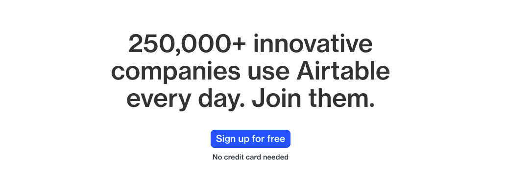
When prospects see that you’re a tried-and-tested solution trusted by other clients, this might help motivate them to sign up, too.

Mixmax could optimize the close (above) by replacing the word “thousands” with a specific numeral. Why should they do that? Because as humans, we usually associate numbers with facts. So among all those words, a numeral can stand out and attract a potential clients. By being specific, you can gain more attention and trust.
Even if you don’t have a large user base, you can still leverage social proof. You could show your expertise, your positive customer reviews or any third-party certifications.
Use this social proof to convince prospects that they can trust your business so you can convert them into leads.
6 Essential Web Design Elements to Boost Your Website’s Conversions
Make your close short but impactful
How to use this: Emphasize your offer, pop a CTA in there … and call it a day.
Sometimes simple is best. This shorter close is great at reminding the reader of what the next best step is. But it’s not always the most persuasive.

To increase conversions – while still having a short close – give your prospects an exciting reason to sign up (or get in contact). Don’t just demand they do it. Instead, remind them of the goals they want to achieve. That way, even hesitant prospects will be more likely to convert to your solution.
Notice how the following closes are short, but you’re still given valid reasons to click the CTA.

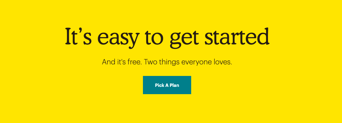
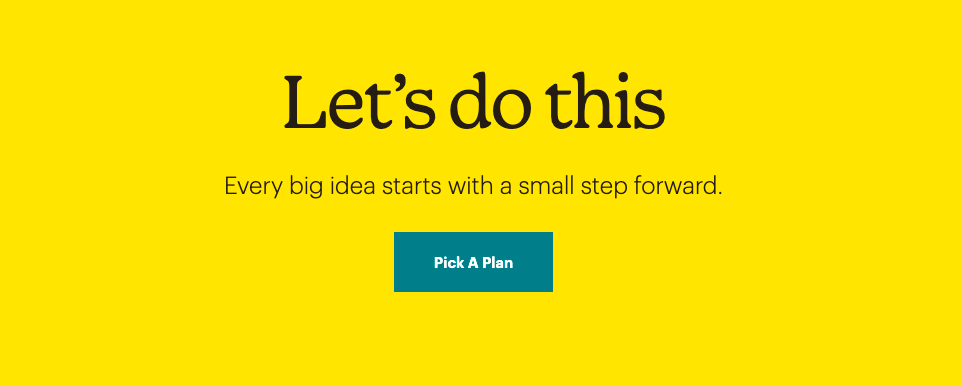
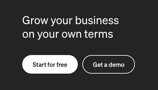
Power-related words can be effective at motivating your prospect. And Klaviyo’s close (above) puts the reader in control.
This reminds prospects of why they should invest their time in a demo or a trial – i.e. because they’re determined to achieve business growth. It’s a valid reason to sign up.
If you help your prospects feel optimistic about you, you could increase your brand’s likability. Note that optimism is one of the four most powerful emotions that can help increase conversions. Yes, even in B2B.
So consider how you can persuade potential clients and customers that they should invest their time to fill in your contact form or sign-up. Help empower them into feeling less intimidated about making a change so you can turn that fear into confidence.
Give prospects your risk-free offer
How to use this: Acknowledge the main objections your prospects might have. Reduce their doubts within your web page’s close.
Many of your prospects will have hesitations about your solution. These hesitations will roam around in their minds as they research your website – distracting them from signing up.
For AWeber, the main anxieties their (small business) prospects tend to have are payment related. So what does Aweber talk about in their close?
They point out that no, you don’t need to give them your credit card details. In fact, with their free plan – you don’t need to pay at all.

Meanwhile handles objections from prospects like “I don’t know if your solution will be worth the investment.” They remind prospects that if they use Crazy Egg’s tool, they’ll have the potential to achieve revenue uplifts.

Notice how Crazy Egg has optimized their CTA message. The “Build My Custom Plan” button (above) links to a demo sign-up page. Would you expect a demo page from clicking that button? Possibly not.
The reason they talk about building a plan is because their prospects have likely researched other SaaS websites. As a result, these prospects will repeatedly see common CTA messages like “Request a Demo” and “Speak to Sales.” These buttons can become generic and therefore don’t grab the prospect’s attention.
So instead, Crazy Egg uses a call-to-value to make the action sound useful and worthy of exploring.
When creating a call-to-value, aim to complete the phrase “I want to….” For Crazy Egg, their prospects will want to increase website sales. Another call-to-value for them could be [I want to] “Convert more web visitors.”
Meanwhile, ConvertKit takes a unique approach. They show empathy for the prospect as they acknowledge how hard it is to pick an email provider: it’s “a big deal.”
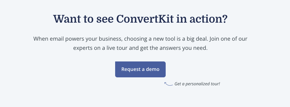
Given how oversaturated the email software market is, this messaging may resonate with your potential customer. They may feel the anxiety of not knowing which software to choose: “Am I making the right decision if I choose ConvertKit? Will I regret this later?”
So ConvertKit plays it smart. They don’t frame their demo offer as a pushy sales tactic. Instead, they position their demo as a solution to all these overwhelming options.
According to this close, customers won’t be speaking to a mere salesperson. They’ll speak to an expert who can answer questions and help them make the right decision.
When you adjust your website messaging to be less focused on merely describing your solution and instead focusing on persuading your prospect, you’ll treat messaging like a sales conversation.
Remember: Sales conversations that achieve success tend not to rely on basic tactics – instead, they use persuasive principles.
Many of your prospects will be doubtful and won’t want to take action. So your messaging should increase their motivation. Use relevant copy that talks about the client and how you can help transform their lives. That way, they’re more likely to pay attention to your brand and convert.


