Over the past few years, you’ve probably seen an explosion of bright colors, loud patterns and innovative designs when it comes to graphic design. However, those bold techniques are going to take a big step back in 2020.
In fact, the most popular trends this coming year are going to be very reserved, natural and timeless in comparison. But let’s be honest, as an entrepreneur or small business owner, it’s pretty hard to keep up with all the new graphic design trends. Especially if you’re creating a lot of your own visuals and graphics. Even though I work for a design company, I find myself creating a lot of my own marketing graphics. I feel your pain! So instead of covering all of the new trends, I thought I would highlight a few that all entrepreneurs can learn to use in 2020.
If you want to see all eight graphic design trends for 2020, be sure to check out the infographic at the end of this article.
Genuine stock photos
I thought it might be a good idea to start with something that literally everyone has used before: stock photos. I used to hate using stock photos and told people to avoid using them at all costs, too. Most of the time when people share them on social media, they just add to the noise, instead of attracting someone to your content.
However, I have recently found that they are very useful if you pick the right type of stock photos.
And in 2020, the right type of stock photos are the ones that look actually genuine and authentic. Almost like your friend snapped a photo of a person, location or event while you were exploring the city.
For example:
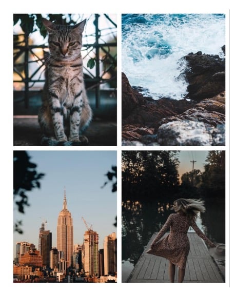
I know this sounds a little backward, as stock photos are supposed to be so ambiguous they can be used in thousands of different situations. Nowadays, almost anyone can create very genuine and specific stock photos in a manner of minutes. You can find one in even less time on Unsplash.
Consumers are truly tired of the overly edited and processed photos that dominated social media for the past few years. So I would recommend trying to use more genuine stock photos in all parts of your marketing this year. Plus, these stock photos work exceptionally well with our next design trend!
Related: StartupNation Business Services: Graphic Design
Muted color palettes
Next, let’s talk about color palettes. After years of vivid colors being used extensively, muted color palettes are going to be very popular in 2020. If you’re not familiar with muted colors, they are basically the exact opposite of vivid colors. These colors have been created by adding black, white or a complementary color to the original color.
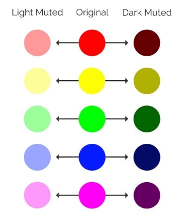
I believe that this trend is a direct reaction to the overuse of those bright and bold colors. Once so many brands begin doing the same thing, like using those bold colors, to stand out, you really need to go in the other direction.
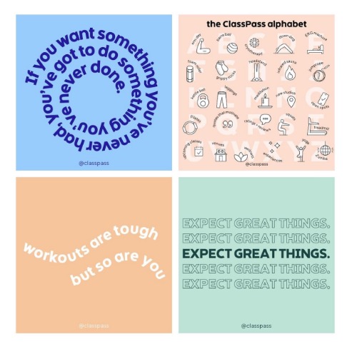
Huge brands like Apple, Classpass, LinkedIn and more have already started using these muted colors across their graphics:
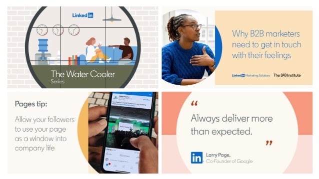
I like using muted colors because they don’t really overpower the rest of the graphic.
For example, you can easily read the text in the examples below:
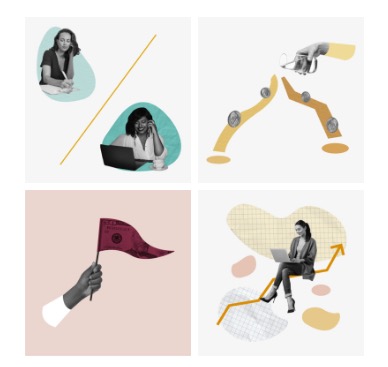
Instead of distracting from the focal point of the graphic, a muted color palette can make your designs feel more refined, harmonious and modern, as well. Like so:
So if you want to try one graphic design trend in 2020, I would recommend using more muted colors. You can even take your existing brand colors, add some black or white, and create a whole secondary color palette in a matter of minutes!
Heavy simple fonts
Fonts are one of the only things that are going to actually be a little louder and bolder this coming year. When you look at what we just went over above, this trend makes a ton of sense.
As color palettes and images become more muted or reserved, the fonts used with them have to become bolder. Otherwise, there will be an overwhelming lack of contrast leading to less eye-catching graphics.
Anyways, those fonts are going to be heavy or extra bold this year to balance the other trends.
There are a number of font weights, from light to regular and bold:
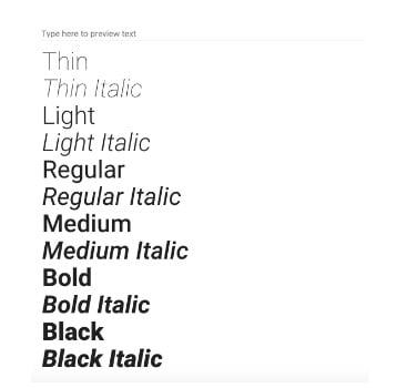
The heavy fonts are usually extra bold and will be found at the bottom of that list.
When used with other graphic design trends like muted colors, these fonts can give your graphic a modern or contemporary feel.
For example, check out how Hootsuite uses bold fonts below:
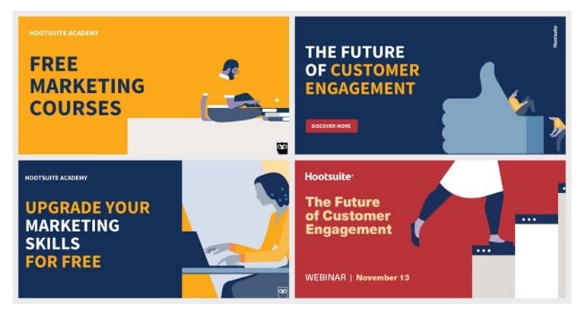
In those social media graphics, the bold font makes the blog post title the main focal point. A thin or minimalist font wouldn’t have the same effect at all. It probably would have been overwhelmed by the graphic or illustration in each social media image.
Sign Up: Receive the StartupNation newsletter!
The same thing can be said about these graphics from Acoustic:

The only difference is that their designers used an extra bold font to create some nice visual hierarchy. Now a reader will know where to look first instantly. The only downside about these heavy fonts is that you can only use them sparingly. I would recommend only using these bold fonts to enhance single words, short phrases or titles. Anything more than that and your text becomes less eye-catching. Just remember, don’t overuse them and you should be fine.
Now, check out the infographic below to review all eight graphic design trends for 2020.


