
You’ve spent a lot of time and effort driving traffic to your ecommerce store. You’ve optimized your site for SEO, created catchy ads, posted engaging content on social media — the whole works.
But then comes the tricky part: what happens when visitors land on your site? Do they stay and explore or leave after a few seconds?
If you’re like most ecommerce store owners, you probably have had your share of bounces. And your goal — to make sure visitors don’t leave your site without taking any action, such as clicking on a product, adding it to the shopping cart, or subscribing to your newsletter, is no walk in the park.
But you don’t have to worry! There are ways to reduce your bounce rate and boost your engagement.
In this post, we’ll share some proven tips to help you keep your visitors interested and hooked on your site. These tactics will not only improve your user experience but also increase your brand awareness, loyalty, and conversions.
Social video, protecting your IP — discover more from Verizon Small Business Digital Ready
1. Get Personal with Interactive Content
Considering the fierce competition for online eyeballs and audiences’ dwindling attention spans, you have a very tiny window of opportunity to stand out from the crowd and keep your visitors engaged and interested.
So, how do you do that?
The answer is interactive content, and here’s why.
People are tired of the traditional static content that puts them in the role of passive recipients of your marketing message. Although it can be informative, value-packed, and fun, it has a drawback that stands in the way of engagement: it can be generic and lack relevance.
As a matter of fact, 76% of people are frustrated when companies fail to deliver personalized interactions.
To avoid this scenario, double down on quizzes, polls, surveys, infographics, calculators, and other interactive tools that require your customers’ active participation.
But most importantly, interactive content is more personalized and relevant than static content because it adapts to the user’s input and feedback. It creates a dialogue between you and your audience that makes them feel like they’re included in your content creation process. Finally, interactive content also delivers outcomes or solutions tailored to your audience’s individual needs and goals.
The Product Finder Quiz on FOCL is a perfect example of interactive content that gets website visitors engaged. Many shoppers, especially those that are unfamiliar with niche health solutions, can be intimidated by a large inventory of products, each addressing very specific symptoms.
The brand solves this conversion obstacle by asking a series of questions and creating a personalized list of recommended products based on the shopper’s response.
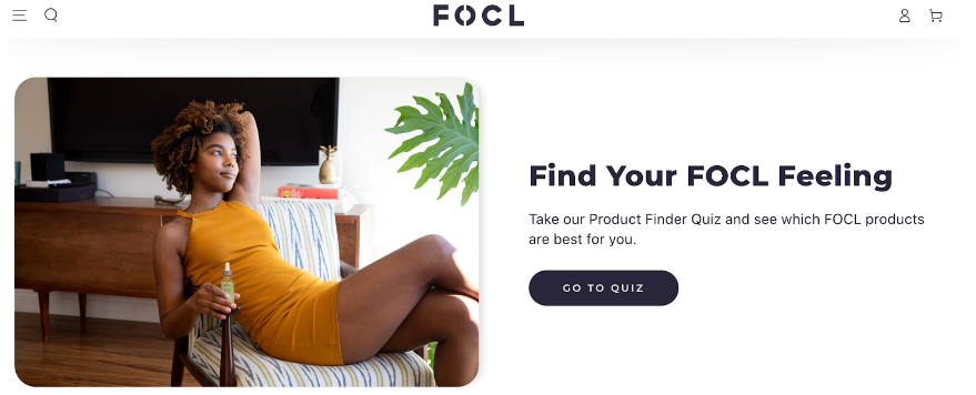
Source: FOCL
2. Resolve Potential Trust Issues
Gaining your audience’s trust is crucial if you want them to purchase from your ecommerce store. Remember that, unless you’re a well-known brand, they need some proof that it’s safe to give you their personal information, such as their credit card number. Failure to do so is one of the top five reasons for shopping cart abandonment.
In short, skeptical first-time customers might bail if they don’t get the impression they can trust you, and this especially applies to certain target audiences, such as elderly people.
So, your task is to convince your ecommerce site visitors that you’re credible. But there’s another factor you should be aware of: it takes only 0.05 seconds for your visitors to form an opinion about your website and decide whether they want to stay and explore it further.
It’s crucial to dispel their doubts by displaying trust signals right away. Although you should optimize your entire website, your homepage and product pages are critical for building trust.
Homepage trust signals
Let’s not forget that a huge portion of offline traffic goes directly to your homepage. Besides that, many potential customers use it as a hub to learn more about your brand and navigate to the other locations of your website. That’s why your homepage needs to come across as trustworthy.
Take a cue from the ShopSolar, which is packed with different trust signals. Their header communicates that the company offers free shipping, lifetime customer support, and the lowest prices. There’s also a phone number so potential customers who prefer traditional communication channels can reach customer support. This detail makes all the difference to people of certain ages who aren’t sure how or don’t like to use email or chat.
When visitors scroll down below the fold, they can see social proof in the form of user-generated content. The tactic is to let happy customers do the talking and explain how they successfully installed solar kits with the help of the company’s helpline.

Source: ShopSolar
Product page trust signals
Product pages are where the purchasing decisions actually happen, so it’s essential to minimize any hesitation or friction and get fence-sitting customers to click on the ”Add to Cart” button instead of hovering over it.
Transparency plays a critical role when it comes to online purchases. Don’t forget that your customers can’t touch, feel, and inspect a product in person, which is one of the biggest ecommerce obstacles. It’s your job to give as much detail and information on your product pages to make up for this shortcoming.
Mannequin Mall’s product pages do a great job of addressing trust issues. The company included tick-marks next to trust messages along with detailed info in the tabs section below it that talks about shipping/returns, price guarantee, and satisfaction. Different card logos add another layer of trust, as seeing a recognizable brand makes them more confident and encourages them to buy. A floating Reviews tab shows that the brand wants first-time customers to check out what others who already purchased say about products.
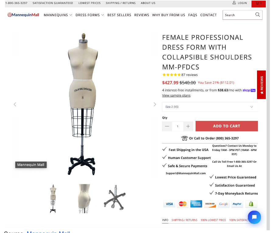
Source: Mannequin Mall
3. Don’t Make Visitors Guess What You’re Selling
One of the most common reasons visitors leave your website without taking any action is because they don’t understand what you’re offering them.
If your website copy is vague, confusing, or misleading about your products or services, you’re losing potential customers.
That’s why you should never make your website visitors guess what you’re selling. You should make it clear what your products or services are all about and what their benefits are right away. This will help you capture their attention, build trust, and persuade them to take the next step in your sales funnel.
Moreover, in case your shop sells niche items, be extremely clear about what they are and what makes them unique.
State these unique selling points above the fold, where they’re highly visible, and make sure that they target your audience’s pain points or something that’s important for them. You can do this by adding value and differentiation signals to your messaging to highlight what sets you apart from the other brands in your industry.
The Vivion homepage features a couple of headings displayed one after another that explain what the brand offers and what the benefits of its products are. For instance, these statements read ”Ingredient Solutions for Everyday Applications” or ”Quality Excipients on Hand to Support You When You Need Them.” This way, customers won’t scratch their heads and ponder if this is what they’re looking for.

Source: Vivion
4. Make Product Browsing Easy, Intuitive, and Interactive
Once your visitors reach the product category page, they’re close to being purchase ready. But they can easily change their mind if they can’t find what they’re looking for.
To prevent this very frustrating worst-case scenario, make your product browsing experience user-friendly and intuitive.
Here are some tips to help you achieve this goal.
Offer detailed filtering options
One of the best ways to do this is to provide detailed filtering options allowing your visitors to narrow their search based on various criteria, such as price, size, color, brand, rating, or any other relevant parameter.
This way, they can quickly find the products that match their preferences and needs and avoid wasting time on irrelevant items.
Present your products in the best possible light
High-quality images and videos that showcase your products from different angles and in different contexts are a must. This can help your visitors visualize how your products look and feel in real life, compelling them to make a purchase.
Adding detailed information such as dimensions, colors, features, and specs, as well as the Ask a Question section, will boost your conversion rates too. People want to take a good look at the item they’re buying and learn as much as possible about it. This tactic allows you to handle their potential objections and nip them in the bud.
For example, if you look at the Pitching Machines collections page on Anytime Baseball Supply you’ll see it comes with extensive filtering functionality, meaning that their customers don’t have to browse through all the numerous products, searching for the right piece of baseball equipment. To make navigating product and category pages even easier, there’s a convenient search function. When customers click on it, a slider shows up, displaying different website sections such as the Help Center, About Us, or Blog. This easily accessible menu makes navigation a breeze.
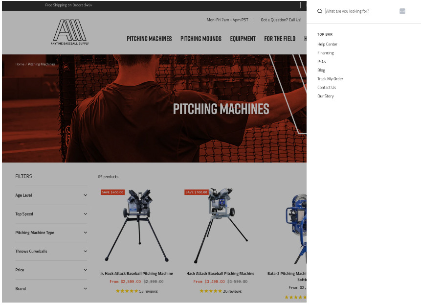
Source: Anytime Baseball Supply
5. Improve Page Loading Speed
So, a potential customer has found your ecommerce store through Google, ads, or social media, and they click on the link, impatiently waiting for the website to load. This is where the plot thickens, as mere seconds decide whether they will bounce off or land and start browsing products.
Stats say that sites that load in one second boast a 7% bounce rate. This number grows exponentially, meaning that websites that take three seconds to load have an 11% bounce rate, while a five-second loading speed results in a 38% bounce rate. In other words, you could be losing more than a third of your potential customers just because your site is too slow and sluggish.
There’s more — another stat claims that a one-second increase in page load times can boost conversions by up to 27%.
Here are a few tips to help you get it right:
- Use a fast and reliable hosting provider offering SSD storage, CDN integration, SSL certificates, and 24/7 support.
- Optimize your images and videos. Large media files can slow down your site and eat up your bandwidth. Compress them using third-party tools or the GZIP method. As for videos, post them on a third-party platform like YouTube and then embed them on your site.
- Minify CSS and JavaScript files and combine them. This will allow you to reduce the file size and the number of HTTP requests, which will, in turn, speed up your site.
- Enable browser caching and GZIP compression. Browser caching enables your site to store some files on the user’s device, so they don’t have to download them again on subsequent visits.
6. Avoid Design Clutter
According to almost 85% of web designers, crowded design is the most common mistake small businesses make.
This makes sense if we bear in mind that a cluttered ecommerce website layout can be overwhelming. Trying to find a product or a piece of information on a chaotically organized website equals looking for a needle in a haystack.
This problem negatively affects your visitors’ attention spans and distracts them from their (and your) main goal — to convert.
So, decluttering your web design isn’t only about visual appeal and aesthetics but also user experience.
Let’s see how you can do this and help your customers focus on your offerings:
Leverage negative space
Also known as white space, this is the empty space between and around the elements of your website. It helps to create contrast, balance, hierarchy, and focus on your website while giving your visitors some breathing room.
Use a clean layout
A clean layout is one that organizes your content in a logical and coherent way. It helps your visitors to scan, read, and navigate your website easily. Headings and subheadings can help you organize your content and improve its flow, while bullet points, visuals, and short paragraphs allow you to break up your text into digestible chunks.
Opt for clear typography
Typography is the tactic for arranging text in a readable and attractive way. It helps to communicate your message and tone of voice. Choose a font that is legible, simple, and matches your brand style. Use no more than two font families and use them consistently throughout your website.
The Pumpkin home page is a terrific example of how to strike a balance between design simplicity and effective communication. The page has a lot to say – conversion is highly dependent on people understanding how their product works and how it differs from their many competitors.
It would have been easy to prioritize messaging over accessibility and overwhelm visitors with a complex UI. However, the site’s designers wisely used plenty of negative space, a visually welcoming layout, and a modest amount of text that communicates what is absolutely necessary.

Source: Pumpkin.care
The SuN Takeaway
The math is simple: the higher the bounce rate, the lower your profit. Although improving this metric is no easy feat, implementing a strategic approach and improving critical areas and elements of your ecommerce store will turn the scales for you. The trick is to make it easier for your customers to navigate your site, build trust with them, and provide an exceptional user experience.