Recently, at the AWS Loft in San Francisco, HubSpot’s co-founder and CEO, Brian Halligan, discussed how you build a startup and said, “I woke up this morning on my Casper mattress. I put on my Warby Parker glasses and then I picked up my phone and I listened to the Grateful Dead on Spotify.”
He went on to explain that the key to each of these business’ successes lies in their go-to-market strategy and their great word-of-mouth marketing. But those companies also have something else in common: their brand identities have some nearly identical features (and they’re not alone).
When examining mega brands that have skyrocketed to success over the past decade, the vast majority of them seem to have extremely similar logos, color palettes, and, most notably, fonts.
From the cult-followed beauty brand, Glossier, to the 3D-printed braces alternative, Smile Direct Club, to the wildly popular luggage company, Away, there are noticeable commonalities in their identities, despite being in vastly different industries.
It begs the question, is there a lack of creativity? Are emerging brands looking to compliment each other? Has branding as we once knew it evolved to mean something different? And what can startups learn from this as they build their own brands?
Related: 4 Ways Millennials Can Build Personal Brands For Themselves
Creative branding hasn’t died; it has expanded
These companies all have one thing in common: they are innovative alternatives that have emerged in the past decade. They were all digital-first brands that made a name for themselves by providing convenient (often less expensive) options to millennials, proving to be a worthy opponent to the traditional brands Gen X and Baby Boomers loved.
Digital-first brands have something in common: they aim to provide the most efficient, quality experience possible. After all, the digital-first value proposition is that a consumer can acquire a specific product or service without leaving the comfort of their home. That has to translate into design.
To create a quality experience online, the path to learning about the product and in turn, the path to purchase, has to be extremely easy. A sans-serif font is not just easy to read, in comparison to more complicated, artsy logos. Just like all aspects of branding, the simplicity goes beyond that to convey how simple this shopping experience will be overall. Not to mention, common web fonts increase with site speed, further supporting conversions.
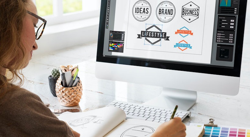
Of course, brand strategists didn’t get lazy. In fact, they got smarter. They realized that, especially in the digital world, branding has to transcend far beyond a creative logo design. It has to stand for the solution a company is trying to solve, which more often than not is simplicity, quality and ease, and it has to be represented in every phase of a customer’s experience.
Startup takeaway: A quality brand experience has never been so important. However, it’s not enough to just look at the logo and tagline. Branding has to be represented in every single element of the customer experience, from the first conversion through placing an order.
Standing out requires simplification
Living in the digital age, the sheer amount of content humans absorb on a daily basis has turned us into a skimming culture.
Whether it’s seeing an ad for Outdoor Voices on the morning commute or scrolling past an Instagram post from THINX, we experience so much content in a day that we’ve cognitively trained ourselves to ignore most of it. However, we’re much more likely to pick up on simplified messaging, from minimalistic product photography to straightforward taglines, because it takes us less effort to examine and process it.
Startup takeaway: Consumers don’t have time for complication. Simplify your brand messaging in all its forms, but especially in your value proposition.
Sign Up: Receive the StartupNation newsletter!
How to stand out
To create a standout brand in the digital age, cross-functional collaboration is required. For branding to evolve into more than just a logo and a company’s identity, that requires some new teammates.
For example, Airbnb now blends its teams so brand designers and product designers work in unison, ensuring that the brand experience isn’t just felt at first look or on the website or at an event, but rather, a consistent idea is established at every touchpoint on the customer’s journey.
Startup takeaway: Don’t silo your team. A brand designer should always be at the table when decisions are being made that impact the customer, because their job is to strategize what that end to end experience looks like.
So, if you’re a startup and you’re trying to determine your brand identity, I have some good news for you: there is no need to reinvent the wheel.
We see this everyday at HubSpot for Startups. Young companies think that the key to making a splash with their brand is to throw the existing rulebook out the window and start fresh. Unfortunately, this usually leads to subpar branding that doesn’t actually resonate with a company’s target audience.
Adopting the principles of design that have made other brands so successful is simply the smart move for your startup. This doesn’t mean you should copy the exact colors, logos, and fonts exactly, of course, but you can embrace the principles that have informed these features: quality, simplicity, and integrated communication.


