

Starting a business is the ultimate dream for many, but often times, what stands in the way of reaching the pinnacle of success is the ever-dreaded pitch deck. Whether it’s for investors, a new partner or a networking group, presenting a pitch can be nerve-wracking.
How can you create a deck that captures the attention of your audience and boosts your confidence in your presentation? We’re going to cover two areas of design that will help you to immediately spruce up your deck.
Narrow it down to the essentials
There’s not a concrete word count that signifies “too much” information, but a good rule of thumb is for each slide to cover one, and only one, main idea. For example, don’t include information about your target audience and your profit projections on the same slide. They are two separate topics and each deserve their own space.
Many presenters often take their script and paste it right into their slide template. That’s a common pitfall you want to avoid. If your audience is reading word for word off your slide presentation, then they have no reason to pay attention to you.
Your pitch deck should do two things: visualize data and call out main points.
Both of these aspects negate the need to have large paragraphs of text. Let’s take a look at an example of this idea of information overload.
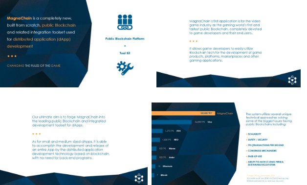
The slide below is from an old deck for a blockchain company that needed to be redesigned. Blockchain is a complex idea, and the presenter essentially used the opening slide to cover what the company does, its demographic, the company’s goals, and what makes them different from their competitors. In addition to all of that text, the slide included a graph that visualized data that had yet to be explained.

This is a very common scenario for pitch deck presentations. Unfortunately, what a design like this does is distract the viewer from the core information, and results in confusion instead of clarity. An audience is likely to react to a slide like this with confusion, and the overload might even disengage them.
6 Simple Rules of Pitch Deck Slide Design
The solution
The solution to this slide is simple: break the information up into four slides, each covering one of the aforementioned topics. This particular deck was going to be sent to investors, so it had to retain larger amounts of copy, but by splitting the information into four slides, it became easier for the viewer to process. If the deck was primarily going to be used for in-person pitches, the bodies of text could have been pared down even further.
Your instinct might be to fill up a slide as much as possible, but I urge you not to. Negative space in a slide allows the important information to stand out, and will be more visually appealing. Don’t be afraid to let things breathe!
Use visual continuity in your deck
After narrowing down the essential information, it’s time to dive into the overall look of the deck. The second most common issue in pitch decks is a lack of continuity. Often times, the extent of “branding” in a deck is having a logo on the first and last slide. Maintaining the usage of colors and fonts throughout the deck will increase its professionalism and appearance.
Using a deck template can be beneficial if you are unable to hire a designer to customize your deck. Deck templates give you a few different layouts while using the same style for all slides. Your logo can be the springboard for the overall style of your deck. Select the most prominent color of your logo as the main color to be used in the slides as a start to your pitch deck branding.
Whatever your primary color is, it’s important to select a contrasting color for the background. Otherwise, you’ll lose legibility and no one in the audience will be able to read a single word on your slides.
How to establish a visual style
The two slides below came from another deck that I was tasked with redesigning. I knew from my initial walkthrough that this deck would benefit from a better established visual style. The slides seemed disconnected, and didn’t resonate with either company’s logo or branding.
For the redesign, I used the colors of their logo as the primary design colors, and introduced a contrasting light pink that would stand out on the dark background. Using the same fonts throughout the deck also aided in establishing continuity and improving the overall look of the deck. Then to help visualize information, I designed icons that matched in style and color to bring all the slides together.

These changes resulted in a deck that reflected the organization’s brand, and better conveyed the information to the audience.
As a general rule of thumb to help with your pitch deck presentation, limit the number of fonts used. In general, having one font for headings and one for body text will help make the slides look cleaner and start to establish the importance of information on the slide. If you need a little more variety, try using the bold or italic style of the font to differentiate information within larger bodies of text.
Conclusion
Keeping these tips in mind will help you create a pitch deck that engages your audience. A deck is meant to be your aid in a presentation, so you want to avoid anything that will detract from your pitch. Understanding these basic design principles will help you turn your deck into a tool that will capture a crowd.