Branding is more than just your business’ name or logo. It‘s in the colors you use, the image you portray, the copy you write and the business statements you make. It encompasses everything you want to communicate about your business on an emotional level, providing a set of associations that tells your customers exactly who you are. Branding mistakes are easy to make, but also easy to avoid.
Here are three ways to avoid the unappealing messages and graphics that cause you to redesign and rewrite all of your web and promotional materials:
Keep it real and protect your brand
Great brands keep it real by offering true statements about what they can do for their customers, whether it’s exceptional service, delivery or uniqueness of product. When developing a realistic brand message that builds honesty and trust, ask yourself the following questions:
- What sets my product, service and business apart from my competitors?
- What value do I provide and how does that value differ from that provided by other businesses?
- How do I want to look in the eyes of my customers?
- How do I visually communicate my promise to customers?
Consistency of communication
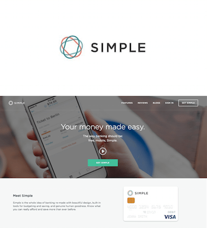
When communicating your values, maintain consistency and stay focused on what sets your business apart. A great example (below) of this visual commitment to brand value is Simple online banking. From its logo to its message, to its entire look and feel, it positions itself as the simple “anti-bank” alternative. Everything looks easy and uncomplicated. It uses images that are user-focused, colors that are soft and restrained, and language that is short, sweet and conversational.

Also on StartupNation.com: Building a Strong Brand Identity
Prevent branding mistakes by keeping everything clean and simple
When brainstorming ideas about the look and message of your brand, there is no point in trying to literally describe everything you do. It’s the most common and obvious trap that many startups fall into. People are more responsive to simple images and phrases than overly complicated graphics and messages.
Don’t be too complicated
The logos below illustrate the need to keep your branding simple. The image on the left is trying too hard to please everyone and spell out what the business is. The branding on the right is clean and uncluttered and allows the viewer to fill in the visual spaces themselves.

Talk to your customers
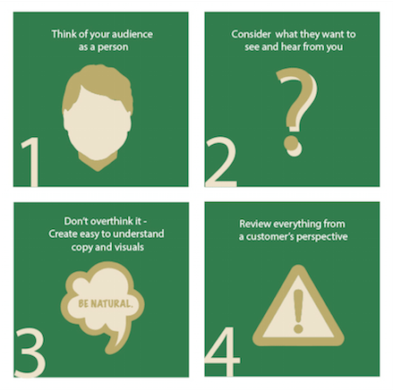
Try to use an original voice and speak to the customer like a person, and not with marketing lingo that’s repetitive and unnatural. The following four-step graphic shows you the easy steps for creating a natural look and voice for your brand.

Stop outbreaks of inconsistency with brand guidelines
Your brand has to build trust and confidence. If every email you send, every flyer you produce and every webpage you create has a completely different look, you don’t have a brand at all. When developing your brand, create brand guidelines to ensure that your brand and message stay consistent, laying a solid groundwork for your future brand as you become more successful.
Create a uniform look and feel
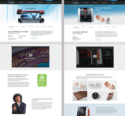
The example below shows details from two pages on the Roland DGA website. These pages represent completely different products. However, through font, color choices, design and copy, they show a consistency of branding that is easy to read and simple to navigate.

Style, message and value proposition
When creating your brand guide, it’s important to point out that it doesn’t have to be a highly detailed document with precise rules. Create an overview of the design style, colors, message and the value propositions you want to communicate.
Here is a checklist to help you create your own brand guidelines:
- Mission statement: one perfect statement that sums up your company goal, purpose and value
- Logo and logo guidelines
- Brand colors: integrate logo colors into overall brand color scheme
- Taglines: value propositions
- Fonts and typography
- Company voice: create a few paragraphs of copy to cement the tone and attitude of your brand
- Imagery: gather photos and graphics that describe the products, people and values of your company
Keep your brand consistently healthy
Your brand is the first thing a customer sees and reads on a business card, social media page, ad or webpage, so it must be meaningful and consistent with the aims and goals of your business. A healthy company brand is one that can evolve without changing. When you develop your company brand, bear in mind that you’re creating something for the long haul, not for the moment, so make sure it’s powerful, relevant and something that you can build on for the future.


