

A startup’s website can feel like a tiny team member that never clocks off. It introduces the business, answers questions, handles doubts, and quietly influences whether someone sticks around or leaves.
Customers notice when a site feels confusing, slow, generic, or difficult to use. They also notice when it feels clear, useful, and designed with their needs in mind.
That puts real weight on seemingly small decisions. The placement of a UI element, the copy of a headline, personalized recommendations, and the customer support experience can all affect how customers perceive a young brand.
For small startups, thoughtful design can create trust without requiring a huge budget.
Below, you’ll learn where to focus your limited resources and how to build a site that genuinely connects with the people you’re trying to reach.
Build Your Business. Get Grant Ready.
Take free expert-led courses and unlock access to tools, mentorship, networking, and Verizon grant opportunities for small businesses.
 We earn a commission if you make a purchase, at no additional cost to you.

Take free expert-led courses and unlock access to tools, mentorship, networking, and Verizon grant opportunities for small businesses.
Personalization Makes Product Discovery More Relevant
Walk into a store where the clerk already knows your taste, and you’ll browse differently than you would in a shop stacked with unlabeled shelves.
Websites work the same way. When a startup’s site responds to what a visitor actually wants instead of showing everyone the same static homepage, browsing turns into something closer to being understood. Customers notice that difference.
Research shows that shoppers given experiences tailored to their interests and preferences become 179% more likely to buy, a number too large for any founder to treat personalization as a bonus.
Implementing this process doesn’t require a large engineering team:
- Ask new visitors a few questions about their interests and use that data to customize their experience.
- Adjust product recommendations, homepage banners, and email follow-ups based on these initial responses.
- Monitor which combinations result in sales and update your questions as you collect more data.
- Don’t worry about achieving perfect accuracy immediately. The objective is to create a simple system that improves as more visitors use your website.
A brand that shows how far this approach can go is Scentbird, a monthly fragrance box.
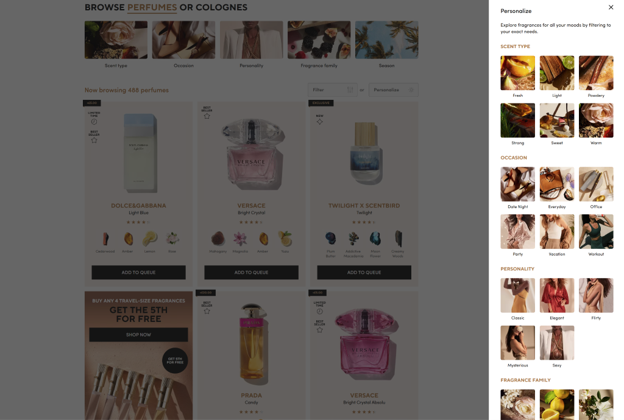
Perfume shopping online carries an obvious barrier—nobody can smell through a screen. Scentbird dismantles that friction by making preference discovery the central experience. The company allows customers to select their preferred scent types, occasions, personality traits, and seasonal inclinations.
The recommendations that follow feel curated for that individual rather than pulled from a generic algorithm. What could’ve been an overwhelming catalog turns into a manageable, exciting exploration—one that makes visitors feel like the site actually gets them before they’ve spent a dollar.
Source: scentbird.com
Real-Life Use Cases Help Customers See Where Products Fit
A product spec sheet tells visitors what something does. A real-life scenario tells them what changes once they own it.
When someone reads a list of features, they have to do the mental work of imagining themselves using the product. When they see someone just like them already using it, that work gets done for them.
The difference between “I understand this product” and “I need this product” often comes down to whether a visitor can picture themselves in the scene.
To build this into your site:
- Identify the moments your product actually gets used. Think through a typical day for your customer and pinpoint where your product steps in.
- Show those moments on your product pages.
- Display photos, short clips, or simple illustrations that put your product in context instead of floating on a blank background.
- Pair each scenario with a line explaining the specific problem it solves. The more specific and relatable the scene, the easier it becomes for a stranger to see themselves in it.
Spotminders sells slim tracking cards for items like wallets and bags. The company designs its product pages to focus on practical applications.
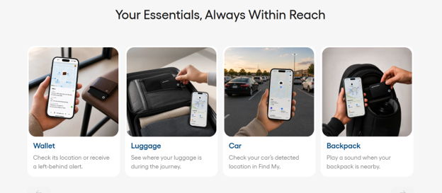
For instance, its tracking card product page includes technical specifications, but it primarily focuses on common customer situations. It displays the card inside a wallet, stored in luggage, and attached to a backpack. The page also demonstrates the card tracking a vehicle or belongings and syncing with a mobile app.
Each example addresses a specific way a customer might use the device. By the time a visitor reaches the bottom of the page, they have seen how the product would function within their daily activities.
Source: spotminders.com
Customer Participation Creates a More Collaborative Buying Experience
Certain purchases work best when the customer sits in the passenger seat, following recommendations inspired by browsing habits. Other purchases work better when the customer takes the wheel completely.
Giving a person the controls to shape their own product, instead of predicting what they might like, alters their relationship with the purchase before it’s made. They’re not selecting between options chosen by someone else but creating something that didn’t exist until they made it.
Custom product configurators usually generate a conversion lift of 20-40% for the items they are built around, a rise that reflects how invested a person feels after having a hand in the design.
To apply this to your site:
- Break your product’s customizable features into a guided sequence instead of presenting every option on a single page.
- Guide customers through choices one step at a time.
- Include type, size, color, finish, or any attribute that applies to your product.
- Provide a live preview when possible, allowing customers to see their choices take shape.
- Include a comment field near the end, giving customers a way to add personal touches that your standard options cannot capture.
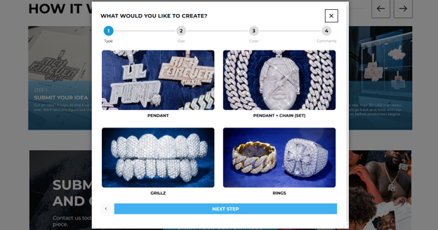
Icecartel, a men’s moissanite jewelry brand, created its custom design tool around this exact structure.
Customers who design their own piece move through four guided steps—selecting the jewelry type, choosing the size, picking the color, and leaving a comment that describes the look they want. Each step builds on the previous one, turning what could feel like an overwhelming set of decisions into a smooth, collaborative process.
By the final step, the customer isn’t just buying jewelry. They’ve been able to design their own product from the first click, and that sense of ownership carries directly through to checkout.
Source: icecartel.com
Self-Service Support Makes the Website Useful After the Sale
Most founders think of their website as a sales tool, something that stops mattering once the checkout button gets clicked. That thinking misses half the picture.
Customers keep coming back to a brand’s site after they’ve bought something, hunting for answers about shipping, billing, or how to actually use what they paid for. If they can’t find those answers on their own, they end up in your inbox or, worse, they give up and never buy from you again.
A site that answers questions before customers ask them turns into one of the quietest, most effective retention tools a startup has.
To implement this:
- Track the questions your support team already answers on repeat.
- Turn those into short, clearly labeled articles organized by topic, such as orders, billing, product use, troubleshooting, and whatever fits your business.
- Keep the language plain and skip the jargon your team uses internally.
- Add a search bar so customers can find answers fast instead of scrolling through categories.
- Update the content regularly as your product and policies change.
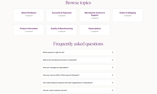
Pendulum, which sells science-backed probiotics, built its help center around this need.
The center covers everything a customer might want to know, before or after buying: the brand itself, accounts and payments, the science behind the microbiome, orders and shipping, product details, quality and manufacturing, and subscription management.
This structure supports both product discovery for new visitors and everyday usability for existing customers, meaning the site keeps earning its keep long after the sale closes. Customers can get answers on their own schedule, and the support team can spend less time on questions the website already handles.
Source: pendulumlife.com
Account Features Give Customers a Reason to Return
Guest checkout allows a customer to complete one transaction. An account encourages them to return for future purchases. The primary difference is the information that the system retains.
Without an account, every visit requires the customer to start over because the site doesn’t save sizes, order history, or previous preferences. With an account, the website maintains a record of the customer’s activity that becomes more useful over time.
Saved items remain available for later. Purchase history allows customers to find information without searching through old emails. Loyalty points build up and provide an incentive to return. These features work together to transform a single sale into an ongoing relationship.
To set this up:
- Start with order history and saved payment or shipping details, so returning customers skip the friction of re-entering information they’ve already provided.
- Add a saved items or wishlist feature next, letting customers bookmark products they’re not ready to buy yet.
- If your product gets used up or needs restocking, build in a simple replenishment option so customers can reorder in a click instead of starting from scratch.
- If you run a loyalty or rewards program, make sure customers can see their points and progress right inside their account, rather than having that information buried in a separate email.
Each addition gives customers one more reason to log back in instead of starting over somewhere else.
Final Thoughts
Most customers won’t tell you why they left your site. They’ll just close the tab and forget you. That silence contains your best design guideline.
Pick one broken moment in your site’s journey and fix it before the end of the week. Maybe a checkout step feels longer than it should. Maybe a returning customer still can’t find their last order.
Small startups succeed by paying attention where bigger companies stop looking.
So, open your analytics and find the page people leave most. Then build for the person who almost stayed. That’s where your next lasting connection waits.
Image by tonodiaz on Magnific