
Perhaps this is the year you finally start your business. On the other hand, maybe you’re an established startup that has had the same website for the past few years with little to no updates. If that’s the case, it’s likely that you are way past due for an upgrade.
Bad web design can sabotage everything from your startup’s conversions to content success. Luckily, you can implement any of the following quick visual upgrades on your website, each of which can be executed in a few days, some only in a few minutes.
So what are you waiting for? Let’s get started!
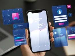
Show off your product in a new way
Your customers shouldn’t be surprised about what they are getting (or not getting) when they download your startup’s app or tool.
Be genuine and open with your clients or customers from the start, and show off your product and its killer features from the get-go. Your product shouldn’t be hidden on a page that only 10 percent of your visitors find. It should be on your homepage, or at least on one of your most visited pages.
A simple screenshot or description is not going to cut it, either. You need some motion or interactivity to really get your customers excited. Not only will it keep them on the main page longer, it will help them learn more about your product.
For example, take a look at what Salesmate does on its homepage.
The entire product is broken down into easy to follow sections. Plus, in each section, the company uses real world examples and people to really sell it. This makes it a lot easier for a potential customer to visualize themselves using it. And finally, this interactive tool is literally the second thing you see after you land on their homepage. Amazingly, this is all done in WordPress.
With customer expectations higher than ever before, sometimes one simple website or e-commerce platform doesn’t cut it. That’s why many sites are leveraging multiple platforms and WordPress e-commerce plugins to extend the functionality of their WordPress sites while keeping visually appealing content at the forefront. Mark my words, this form of headless commerce will make big waves in 2019.
If you don’t have the manpower or resources to build something too complex, a GIF or product video can also do the trick. However, the GIF can’t be something that you slapped together in a few minutes; it needs to show how your product can easily be used to solve a problem.
Related: 10 Proven Ways to Drive Traffic to Your Startup’s Website
Embrace bold colors
I have always been a fan of neutral color schemes and ultra clean design since it was popularized by Apple.
However, after everyone jumped on that trend, it became more difficult for the truly innovative companies to stand out. And as the pendulum swings back from a decade of minimalist websites, bold and innovative color will take hold.
It’s a fact that each year there are more startup companies in the world fighting for attention. Using bold colors on your website will help your brand stand out from that noise.
One of the bigger companies that has fully embraced bold and brash colors is eBay. The company has started using these bold colors on its website:
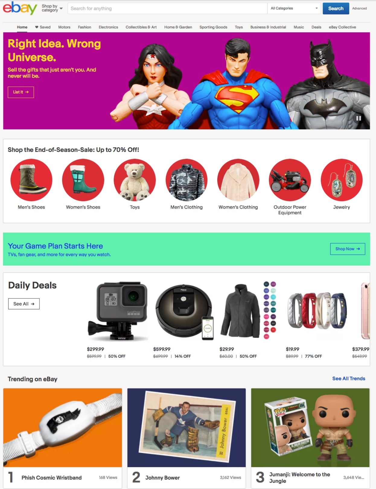
And even in social shares:
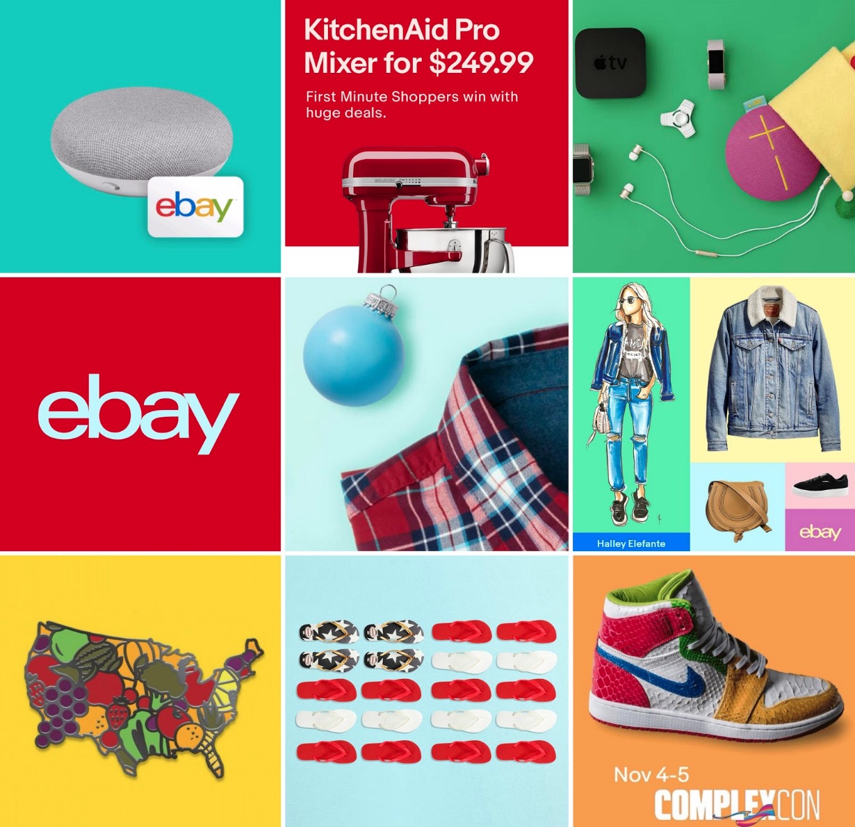
This bright, bold color scheme has become part of eBay’s unmistakable brand. When scrolling through your social feed, you can fairly quickly identify that something is from eBay just by seeing the bright, unique colors they use.
Another company to update their boring color scheme to something more striking is Dropbox. Since they were founded, their color palette consisted largely of white, minimal color and their branded blue.
Now, the brand has completely ditched that reserved palette to take on a completely new creative direction. One scroll through the homepage is all you need to see this full strategy change. But their homepage is not the only place that this new infatuation with color has been seen, just like eBay. Their social feeds have become a playground of color:
It’s pretty refreshing to see so many big companies take a huge risk with their websites this year. As a startup, your site doesn’t have to take a risk that big if you’re not ready for it, but it could be something as simple as using your brand colors more prominently and incorporating them into each and every social post.
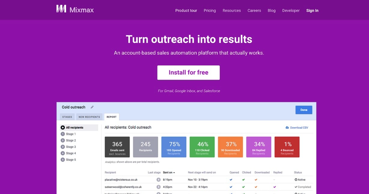
For example, MixMax does so below with their branded purple.
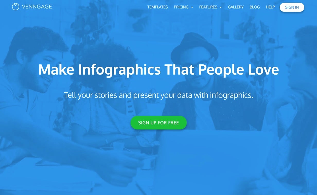
Blue is another popular option. Check out Venngage:
The point is, you don’t need to rethink your entire website color palette in 2019 and conduct a full rebrand. However, you should take some risks and test some new colors everywhere you can!
Add icons and illustrations
Another trend from last year that will continue well into 2019 is the use of hand drawn icons and illustrations.
The use of these illustrations can add a bit of unique flair to an otherwise boring website. Not only are they visually appealing, but no one else can mimic your designs or the feel of your site like they can with text. Additionally, they also help make your company seem more approachable.
Take a look at the homepage of Klientboost, below:
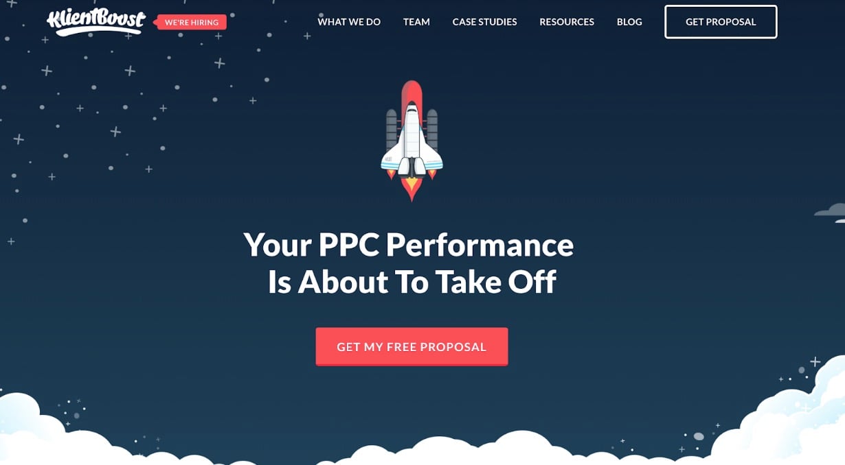
The first thing that your eye is drawn to is the rocket ship icon, which pairs nicely with the snappy copy. The hand drawn illustrations are actually used prominently throughout the website:
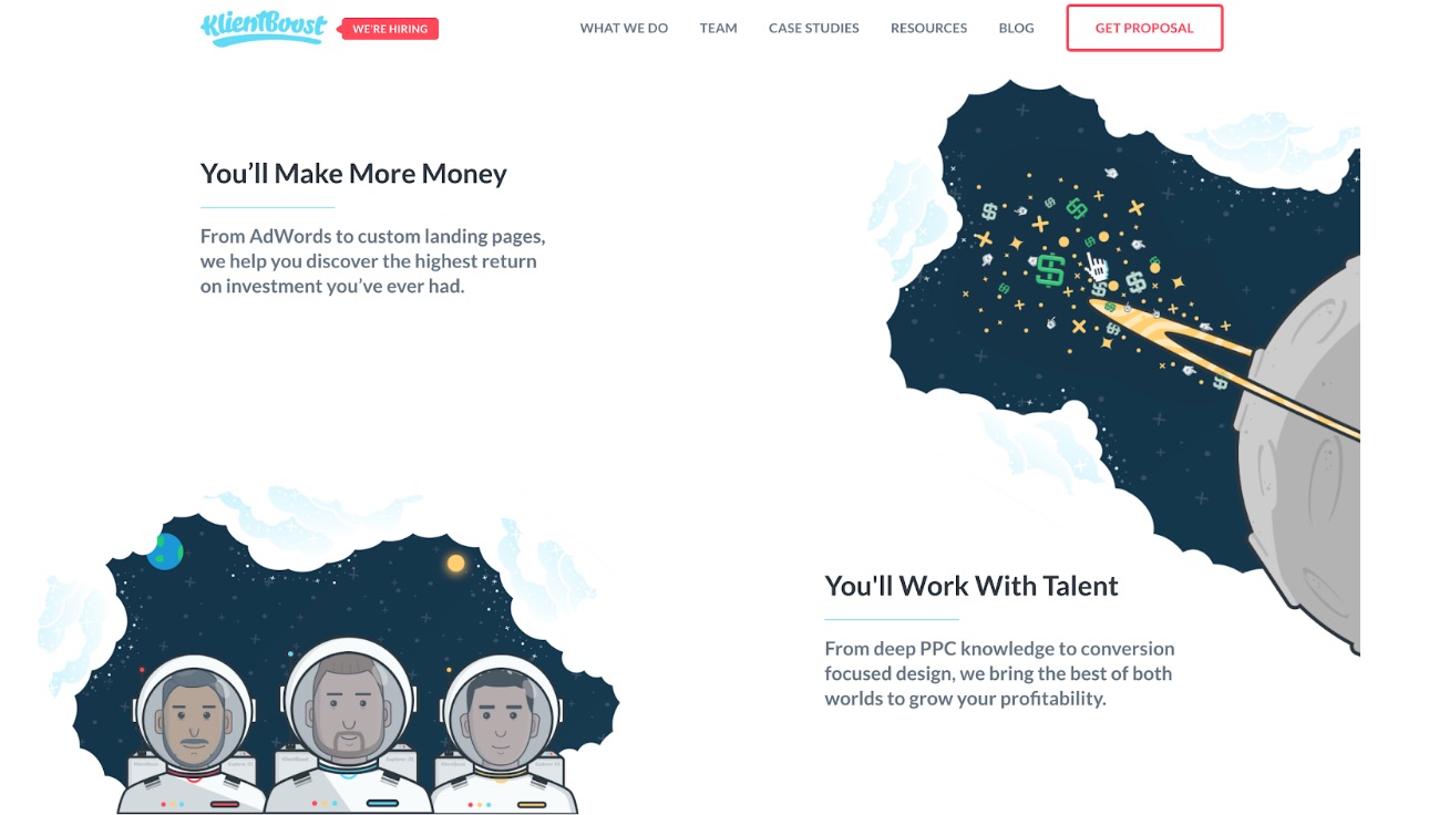
Even though Klientboost deals with some pretty confusing subject matter, the illustrations help them seem relatively approachable.
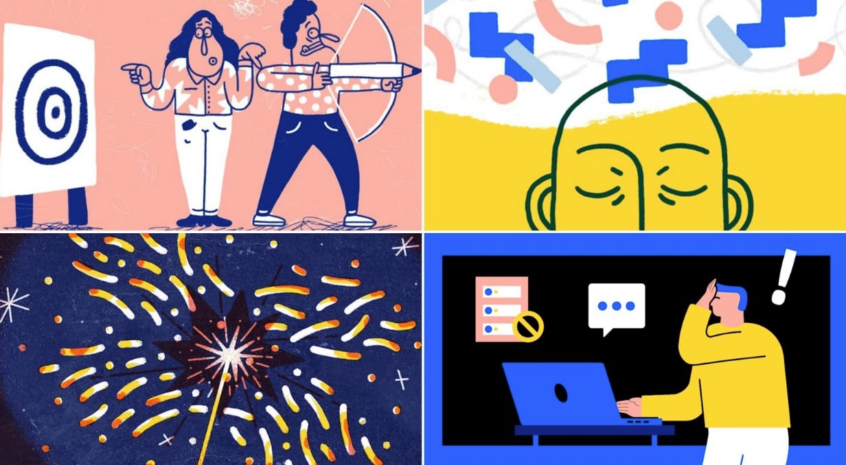
Slack is another tech company that has implemented illustrations well:
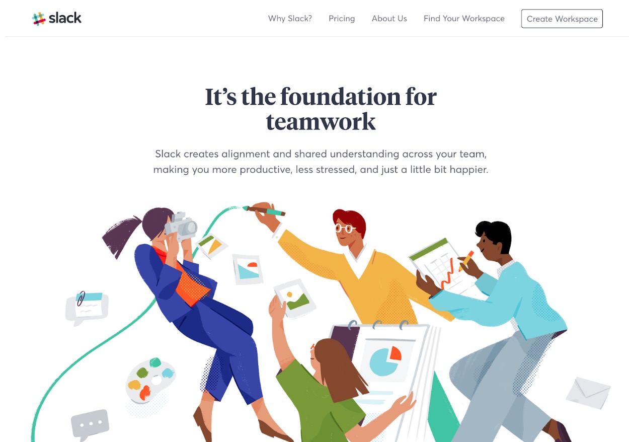
In these illustrations, the designers at Slack are selling people on how their product will make users’ lives easier.
Remember, telling customers just what your product does better than your competitors is not going to work. But, showing them how you will solve their pain points can.
One of my favorite examples of icons and illustrations used on a homepage comes from Discord. One of the pain points that they solve is providing a solid chat app for gamers. Their homepage displays a graphic, which illustrates how their chat app can be used across any gamer device. Within seconds, they are communicating the best part of their product to new users with just a few illustrations.
Keep it simple
In 2019, I beg you to follow the advice of everyone’s favorite manager, Michael Scott, and keep it simple.
I am not advocating revamping your entire website, but taking the time to refine your funnel and strategy couldn’t hurt.
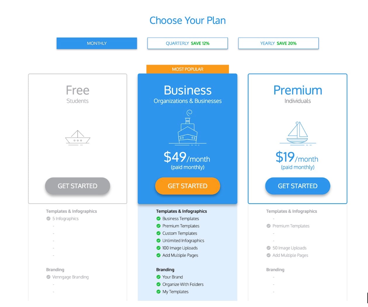
Venngage used the simplifying logic to help create a better pricing page, taking it from a bland mess to this beautiful page, where they highlighted their best plan for the user:
Possibly the most striking example of simplicity and visually appealing homepages is Landbot, a chatbot company that just secured millions in funding.
One of the best ways you can keep things simple is by talking to your users or audience from the get-go (something that Landbot does very well). They will tell you things that no analytics or algorithms ever will!
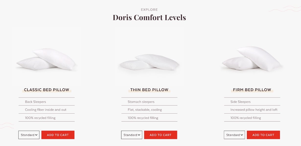
Another example of simple yet effective design is from Doris Sleep. The website’s elegant three-product layout showcases their product’s top features, with bold buttons enticing users to click.
Sign Up: Receive the StartupNation newsletter!
Gradients are back
No we didn’t transport back to the ’90s. Gradients really are making a big comeback this year. These relics are riding the wave of bold color and the rejection of the overly clean websites of the past to become a top trend.
In fact, Venngage’s Graphic Design Trends data called gradients “one of the biggest design trends that will dominate 2019.”
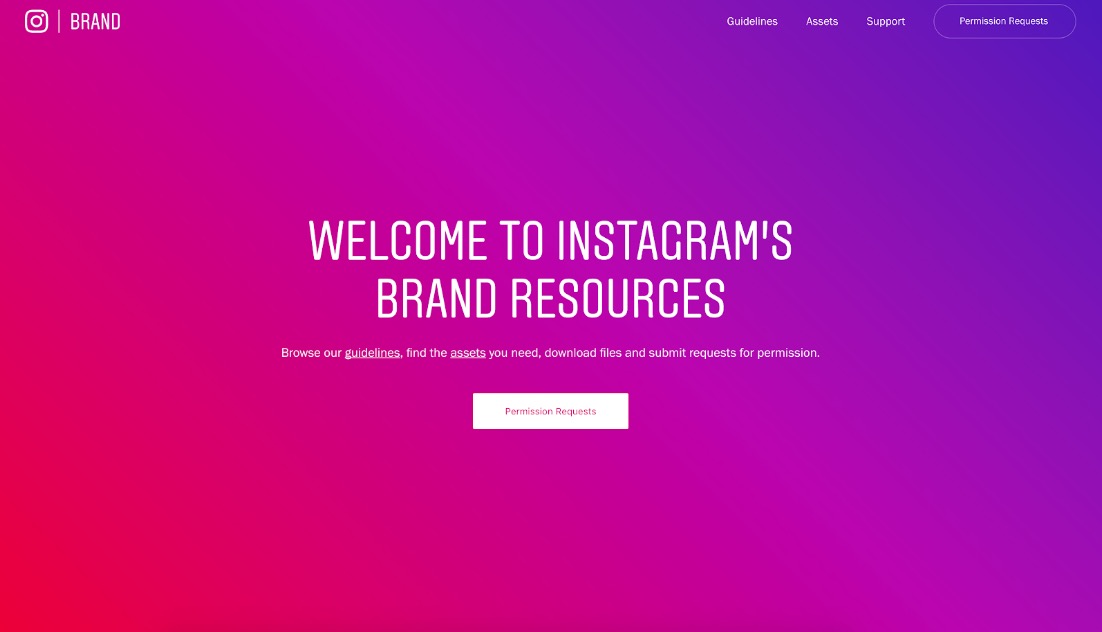
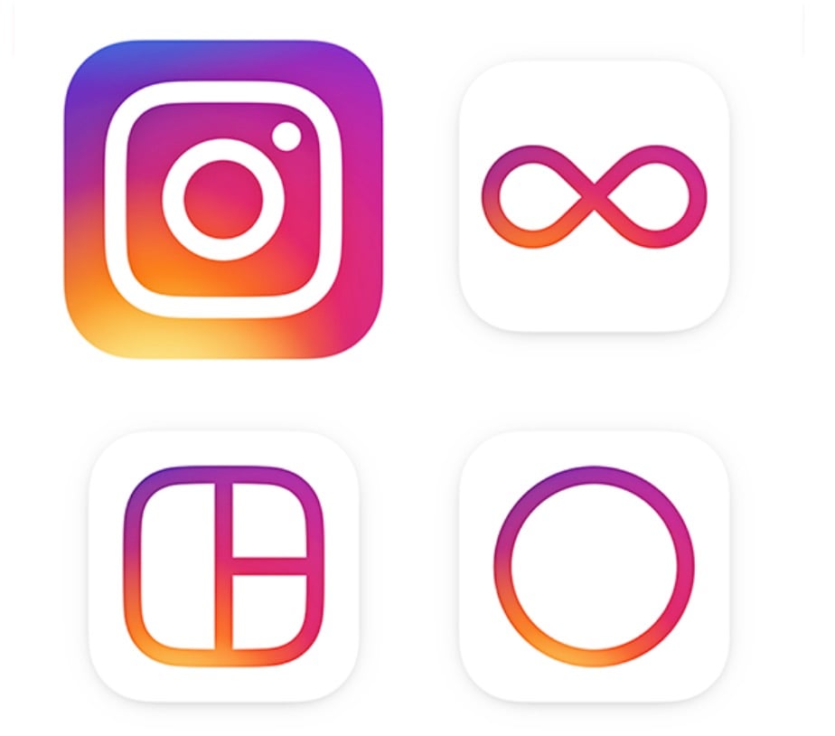
And when you combine gradients with some of your brand colors, your website can really take off. Mixpanel has done just this across their site, and Instagram knew this trend was coming a few years ago, updating its brand completely:
Not only is their main website a gradient haven, each of their apps use a variation of it:
Another interesting example comes from Bannersnack, known as the original online banner maker. Their mix of light blue and purple gives a striking and visually appealing look on one of their feature pages.
Our final example comes from Stripe, which uses a few gradients across its website. They may not have jumped into the gradient trend feet first like Instagram, but their simple one helps create a visually stunning homepage.
Best of all, almost anyone can create a simple gradient on their website or in their marketing plan. There are hundreds of tools out there that can help you design a gradient using your brand colors or something completely new!
Conclusion
Even if each of the above examples are too high level for you, I hope you now have some inspiration for the future of your startup and your company’s ever-evolving web design.
As more and more brands develop online, your startup will have to take more risks to be truly unique. Just like in any other industry, complacency will kill. So be sure to test something new on your website this year. There’s no time like the present!