When it comes to startup brands, a good website design can help you stand out from the crowd. Seamless navigation, clever illustrations and exciting video are just a few elements that can elevate a design and take a brand from good to great.
Plus, startups need all the help they can get to ensure they make an impact and create a lasting impression, solidifying their place in the market and in their dedicated niche.
Ninety-four percent of first impressions and initial consumer engagement with brands and websites are design related. So, your design can’t be lacking when you need to continually capture new consumers to grow your business.
Entrepreneurs can use some web design insights in order to understand how to make the most out of their online platforms, and these 12 web design trends are the perfect place to start, giving startups the competitive edge they need to stay relevant.
12 web design trends essential for growing startups
- Clever Illustrations
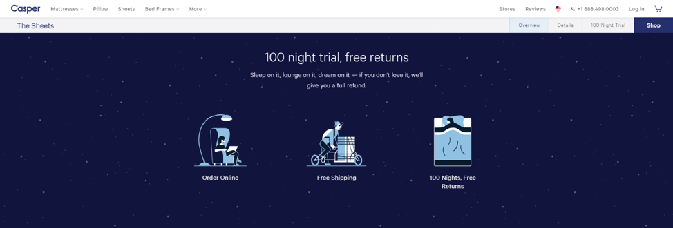
Clever, customized illustrations add a unique quality to a website that makes it stand out from the rest. And custom designs have a way of embodying a brand identity as a whole, displaying it as a leader and an authority in a specific industry or niche.
Casper is a brand that uses creative and bubbly illustrations to its advantage. These unique images stand out from other designs distinctly, adding a playful and airy vibe to the brand, and giving it an identity that’s hard to forget. In addition, these creative illustrations adorn all of their marketing collateral, ensuring they maintain a recognizable brand identity.
- Clear CTAs
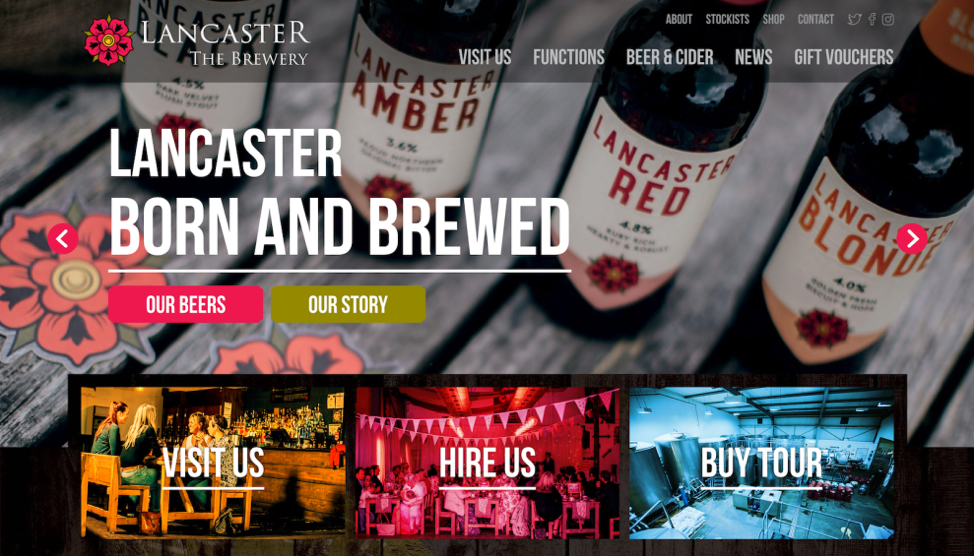
It’s important for all websites to incorporate clear and straightforward calls to action. That’s because CTAs give consumers a direct and concise way for them to navigate throughout your website. They lead them directly to the content or landing pages that are most beneficial to your brand — whether that’s the product pages, a shopping cart or a newsletter signup, turning them into leads.
When it comes to bright and bold CTAs, The Lancaster Brewery website is a clear winner. It utilizes big, bright and vivid CTA boxes to lead users to key pages of the site with ease and with fun. These vivid buttons draw users’ eyes the moment visitors land on the homepage, because these make the desired action extremely clear.
Related: Is Your Startup’s Web Content Designed For Success?
- Intuitive navigation
Clean and seamless navigation is vital for user-experience. Consumers don’t have the time or patience to scroll through a site and search out the information that they need. It needs to be readily available and at their fingertips.
Ninety-five percent of consumers agree that “good user experience just makes sense,” according to a survey, and intuitive navigation aids in this process.
Ensuring that the user journey is simple and intuitive is imperative in startup web design because it lulls your customers along their search with ease and satisfaction, making it more likely they’ll complete the actions you want.
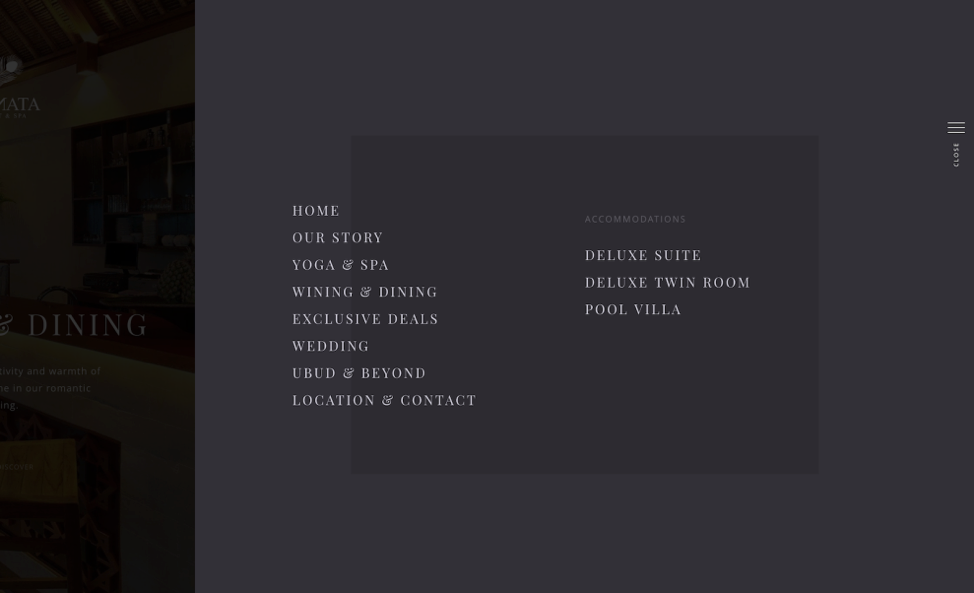
Navigation throughout the Jannata resort website is divine, thanks to its clean layout, clear organizational structure and bold photography that leads users effortlessly throughout the website. An easy to locate white menu on the right side opens up a slightly transparent menu that allows users to focus on the various sections within the website.
- Minimal design
Minimalism is a growing trend in design, and entrepreneurs should take note. Staying on top of design trends is vital for success at all stages of the startup journey, as you want to give users the look and experience they’re looking for.
Minimalism is in everything for interior design to product packaging — but minimalist websites create a serene and peaceful user-friendly interface.
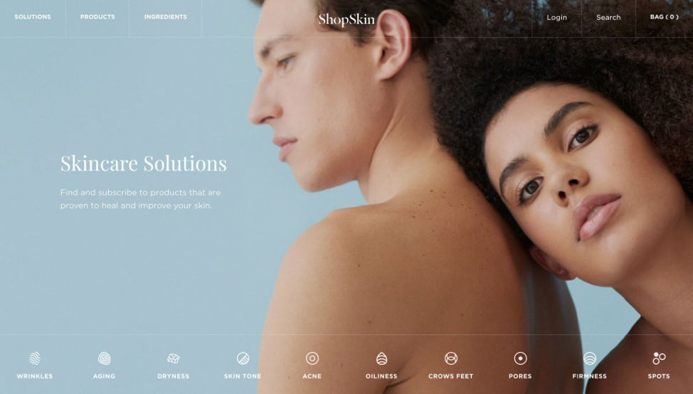
ShopSkin is a U.K.-based skincare brand with a minimal website design focused on product photography and impactful imagery. Subtle scrolling effects take users from page to page with ease, and the overall simplicity of the design makes navigation a dream.
- Easy-to-understand copy
Copy on your startup’s homepage and landing pages should be on brand, easy to comprehend and, most of all, easy to read. You don’t want the copy on your site to be useless or illegible. Ensuring that you’re capturing your voice and your brand identity in a clean and concise way is imperative for informing new users about your brand and its mission. Otherwise, they’ll be confused and inclined to ditch your site entirely.
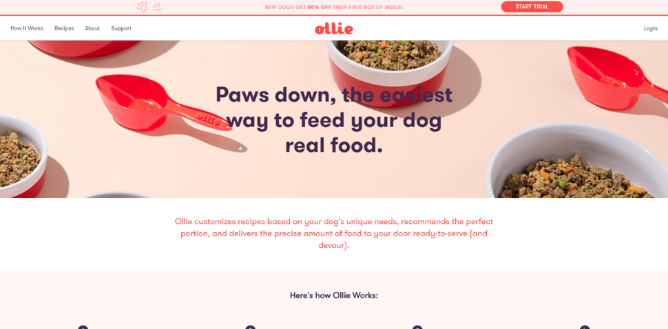
The Ollie website uses clever copy, immaculately capturing the brand and its heart with serene and easy-to-read copy that consumers actually want to engage with. It creates a unique brand identity that is friendly, yet authoritative, and speaks to dog owners everywhere in a playful yet compelling manner.
- Engaging video
Videos have a way of captivating and pulling users in. They can demonstrate a product, promote a brand history, portray customer testimonials and more in an easy-to-digest format. And with more and more people preferring video content over textual content every day, incorporating video is an ideal way to stay modern and fresh.
Plus, according to WordStream, marketers who use video grow revenue up to 49 percent faster, which means investing in multimedia will provide a strong return on investment.
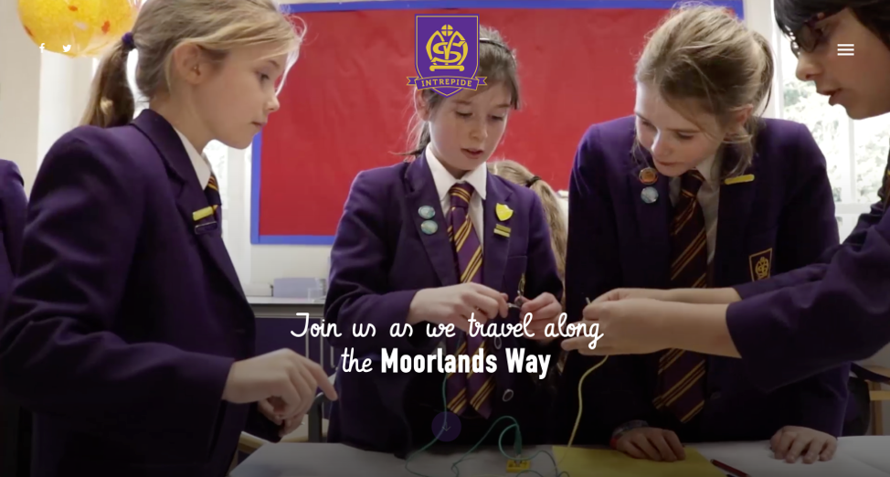
The Moorlands School website is a great example of elaborate and effective video usage, with videos playing automatically as you scroll along the site. This enables visitors to take an inside look at the school and its culture with the help of this engaging design element.
- Creative about pages
If you’re a startup, you’ve got a large mountain to climb. You need to promote yourself and your products, and you need to align them as the best in your industry. But first, you need to let consumers know who you are. You could have immaculate web design, but if your about page is lacking, then users will leave.
Fifty-two percent of consumers look to the “about” page after landing on the home page, so you need one that is dazzling, comprehensive and creative.
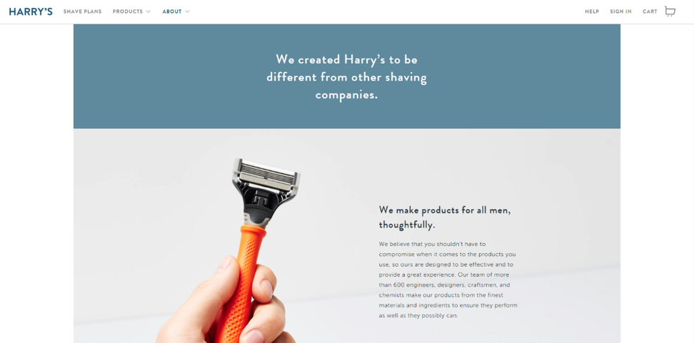
A great example of an about page that excels can be seen on Harry’s website. Here, you’ll see a clever breakdown of the company, its history and its mission, all cleverly laid out and organized so that users can get the full picture of the brand. It’s a clean and organized design that compels their target demographic to keep scrolling and learn more.
- Simple checkouts
Consumers want simplicity. They want what they want when they want it. And for startup e-commerce sites, making sure your checkout page and process is streamlined and simple is a key factor that will set you apart from the rest. If you’ve navigated users all the way to your checkout page, you want to keep them there to complete their transaction. A straightforward checkout is a great way to get them to click “Buy Now.”
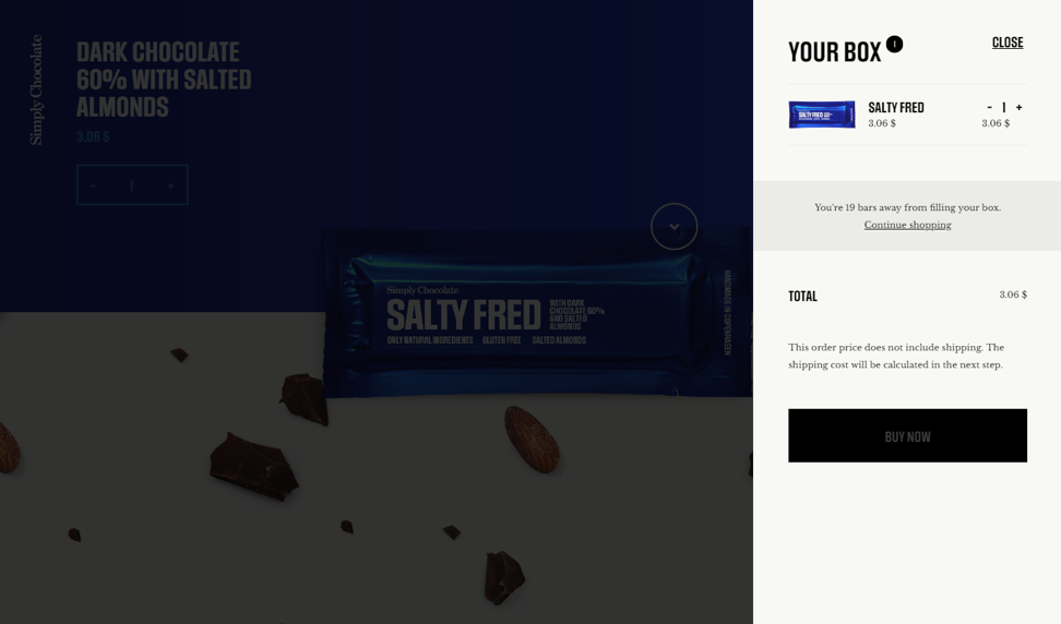
Simply Chocolate’s checkout page is, well, simple and effective, with the cart readily available at all steps of the way and a checkout menu that slides in from the right and makes access easy. Users can reference their cart easily via a simple slider from the right side and can quickly complete the purchasing process when they are done shopping.
Sign Up: Receive the StartupNation newsletter!
- Motion graphics
Motion graphics and animations are a dynamic and engaging way to interact with users. These clever images that move and shake fill users with an energy to keep moving throughout your site to learn more about your company. They also add an innovative air to a brand that makes users more likely to look at you in a positive light.
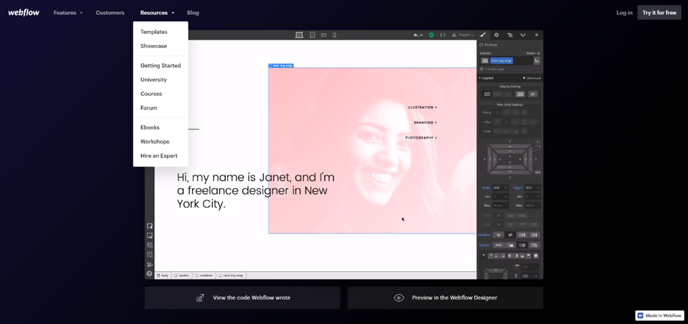
Webflow is an innovative platform that incorporates motion graphics to demonstrate product and service functionality. These motion graphics also create a dynamic quality within the overall web design that captivates consumers as soon as they view it.
- Upfront reviews
When it comes to grabbing attention, reviews are a great place to start. Reviews are a look into your customers’ minds — and nine times out of 10, they’re authentic and truthful. If you can use these reviews to your advantage, you most definitely should. Integrating these comments into your web design can give your visitors a peek into your brand and its reputation all in one place. This also helps creates transparency, which is one of the biggest things consumers are looking for these days.
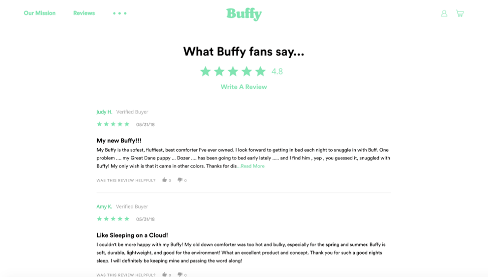
The Buffy site puts reviews on full display, integrating them seamlessly into the website’s design. These reviews encourage engagement and trust between business and consumer, therefore increasing brand loyalty.
- Creative iconography
Icons are used to add a simple and playful edge to a design, as well as to aid in navigation. They can also condense complex concepts in a way that makes hard-to-understand information easier for users to digest.
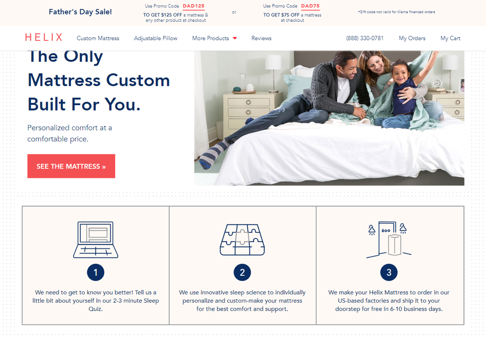
Icons add a clarity and an approachability to a design, and the Helix website incorporates icons at every step to condense concepts and represent how the products work. They are minimal and simplistic, but most of all fun, creating a playful brand consistency across the online platform.
- Interactive elements
Interactive elements get users involved and get them clicking throughout the website. An interactive design, or the integration of interactive elements, make it easier for users to remember your brand and think positively about its overall design. They are more likely to stay on your site longer if they have something that compels them to stay, and functionality that promotes engagement is one way to keep them there.
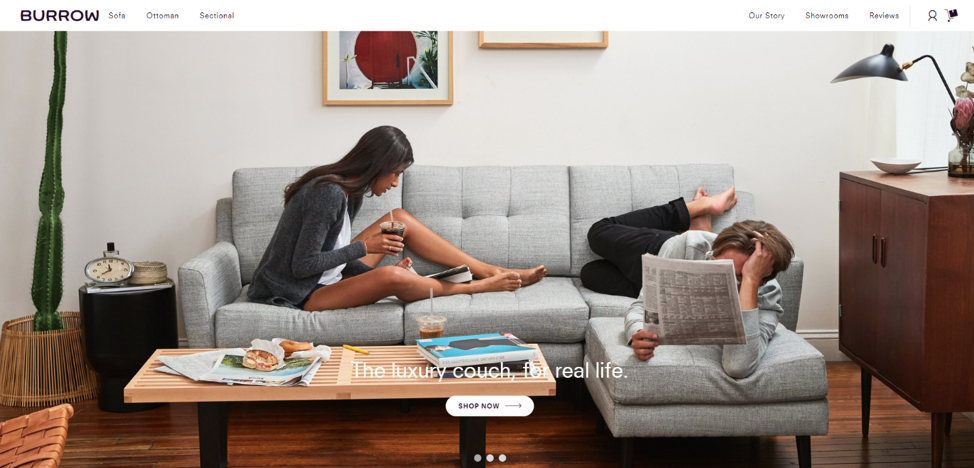
A great example of interactivity in startup website is Burrow. Here, you can find an interactive and engaging functionality that allows users to interact with products through simple buttons and icons, eventually creating the couch of their dreams.
Starting up with web design
Web design is a great way for your startup to establish a reputable brand identity. It allows consumers and other brands to interact with you easily and enables you, as an entrepreneur, to create an authenticity surrounding your personality and products.
Almost everyone is online these days, and almost everybody is interacting with brands online before they ever engage in person. A powerful web presence is the first step to establishing a brand that is bound for success.
If you’re a startup looking to make your mark, start by integrating these 12 design elements and you’ll be on your way to attracting a loyal following before you know it.


