If your business has tried to increase sales with online marketing, you’ve probably heard words like landing page, content offer and conversion, but you might not know exactly what they mean, or how they can grow your business. So, let’s break it down.
Why are landing pages important to your online marketing strategy?
If you want to increase sales for your business, you need to get the attention of prospective customers. You can do that by giving them information they can use. For example, if you sell smartwatches, you could simply provide consumers with a webpage that includes a wide selection of smartwatches and some information about each. Alternately, you could send them an email which links to an article, “How to get a smartwatch that meets your needs without spending too much money.”
That article is what’s known as a “content offer.” You’re offering consumers content that will help them make a more informed purchase and save money in the process. In order to access that important article, you ask them for their contact information, the fair exchange, the quid pro quo. They get the information they want, and you get the contact information you need.
So, when they click on the link in your email (or sponsored ad), they’re taken to a “landing page,” a webpage designed for the sole purpose of collecting their contact information through an online form. Once you have that information, you can send them more content, for example, through emails, which moves them closer and closer to making the purchase you want them to make.
Related: Are You One of the 50 Percent of Small Businesses Without a Website?
Not all landing pages are created equally
When your content offers are compelling, and when your landing pages are effective, they will help you convert more online shoppers into paying customers.
According to Hubspot, companies that create effective landing page strategies have an average increase in qualified leads of more than 55 percent.
Here are five tips to increase your website conversions, generating more leads and driving sales, with a smart landing page strategy:
- Get to the point: When you make an offer in a sponsored ad or an email, people want to see that offer clearly reiterated on your landing page. This isn’t the time to add a lot of unnecessary verbiage. Cluttering your landing pages with glitzy visuals and irrelevant text is a distraction and can slow down your page load time. Focus on the single-most important message of the marketing campaign.
- Highlight your call to action (CTA): Remember that your landing pages are not an end in themselves — they’re an attempt to move consumers to the next step in the process. You want visitors to click on your call to action, which means it needs to be clearly visible. The CTA might be filling out a form, signing up for a newsletter or requesting a quote. If the background color of your page is blue and white, make your CTA stand out by using a different color, such as red or pink.
- Always include your company logo: Your goal isn’t to make one sale, it’s to build a loyal customer base, which keeps coming back for subsequent purchases. The best way to keep your company in the front of their minds is by including your logo on every page. Remember, you don’t just want them to buy a smartwatch; you want them to remember that they bought your company’s smartwatch.
- Include social proof: People tend to more influenced by what other consumers have done or said than the claims you make. To make your pages more persuasive, add brief third-party testimonials, like customer reviews or positive comments from social media sites. It’s also helpful to add influential metrics, like how many consumers have already downloaded the content you’re offering.
- Keep landing page layout consistent: Each of your landing pages is different in that each takes consumers to a different product or service, and each typically makes a different content offer. That said, the layout from one landing page to another should be consistent. That not only reinforces your brand, but also provides a familiar look that visitors can more easily navigate.
Example landing page
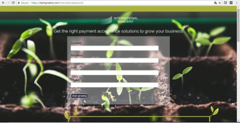
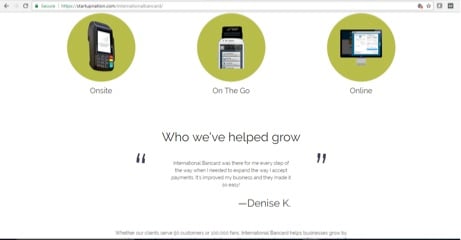
International Bancard’s landing page from our site provides a great example of the tips above in action. The content is concise and clear. The key message of “Get the right payment acceptance solutions to grow your business” gets right to the point. The call-to-action lies in the center of the page on a transparent form fill and is simple to complete. The company’s logo tops the page. If you scroll further down (as shown in second image), a testimonial is included as social proof. The layout and format of this landing page is easy to replicate and carry across other landing pages to instill consistency.


Sign Up: Receive the StartupNation newsletter!
Conclusion
Creating effective landing pages is a key strategy for higher converting marketing campaigns. Always track the metrics, which means compare the number of page visits and conversions across different content offers and webpages, so you can understand what works best for your target audience. Keep well-performing pages in place and edit lower-performing ones regularly.


